

I little while back I analysed the CXR14 dataset and found it to be of questionable quality. The follow-up question many readers asked was “what about the papers that have been built on it?” There have been something like ten papers that used this dataset, but most readers were interested in one of them in particular. This was CheXNet from the Stanford team of Rajpurkar and Irvin et al., who went as far as to claim that they had developed
“an algorithm that can detect pneumonia from chest X-rays at a level exceeding practicing radiologists”.
This would be the first example of superhuman AI performance in medicine, if so. The Google retinopathy paper didn’t claim superhuman performance. The Stanford dermatology paper didn’t either. It is a big claim.
Ever since the CheXNet paper came out in November 2017, I have been communicating with the author team and trying to work out if these claims are true. After a great deal of discussion, I’m now ready to get down and dirty with the paper. Buckle in, this could be a long one. Hopefully you will find it as interesting as I have, there are definitely a few surprises in store.
Important note: I want to make very clear up front that my discussions with Pranav Rajpurkar have been really great. When I first reached out with some questions, I was worried I might get an dismissive or even an upset response. Instead he has been open and fully engaged with me. He has even supplied me with additional results and information (which are included in this piece), and the team changed the paper in response to our emails. While this should be the norm for scientific communication, it often isn’t, and I am thankful for his openness, friendliness, and professionalism.
A CheXNet? What’s a CheXNet?

My children’s TV pop culture references are getting more obscure.
Continuing the somewhat exasperating but undeniably efficient trend of naming applications of neural networks, “CheXNet” is a type of image analysing AI called a DenseNet (a variant of a ConvNet, similar to a ResNet) that was trained to detect abnormalities on chest x-rays, using the ChestXray14 dataset. I’ve spoken in brief and at length about this dataset before, and in summary:
- the labels don’t match the images very well
- the dataset has questionable clinical relevance
- the labels are internally consistent, so systems trained on them seem to learn to reproduce them (along with their errors)
This has been taken by many to mean that the dataset is worthless, although I did mention at the end of the long review that the CheXNet results could hint that there is some silver amongst the clouds.
Before we get to that though, let’s look at the paper itself. More specifically, let’s focus on the experiment where they compare humans to their model, which is reponsible for the headline claims in their paper.
Each section below will have a tl:dr at the top of it, and I’ll do an overall summary at the end.
Versioning
The paper has been updated several times*, and the headline experiment has changed quite significantly between versions. I’ll go through the paper while adding new bits of information and comparing some of the methods between versions. I’ll also reference several earlier reviews of the paper by Bálint Botz (a radiology resident and researcher) and Paras Lakhani (a thoracic radiologist and deep learning researcher). Both of these reviews were for the first version of the paper.
If it is of interest, arXiv keeps all versions available to the public, so you can go and compare them yourself.
The Data
TL:DR while the underlying data has issues, the team has created their own labels which should mitigate this to some extent.
They train their model on 98637 chest x-rays, tune their model on 6351 x-rays, and test it on 420 x-rays. The exact prevalence of pneumonia labels in the CXR14 data is a bit unclear (as explained by Paras Lakhani), but it appears to be between 1 and 2%, so we can see the training set should have almost 2000 cases. The validation set should contain another 100+, and the test set should probabl only contains around 5 to 10 cases.

Image from Paras Lakhani’s blog, showing a range of values for the number of pneumonia cases in their dataset.
NEW INFORMATION 1: Pranav has informed me that the test set is not a completely random selection from the dataset, it is enriched for each label. There are around 50 cases for each of the 14 disease categories. So each example is randomly selected from among cases that have the label. This is a fine thing to do, but it should have been mentioned in the paper.
Several researchers including myself raised the possibility of patient overlap between the train, validation, and test sets. This could greatly inflate the performance of the AI, which could just learn to recognise people rather than diseases.
NEW INFORMATION 2: There is no overlap between the sets. This has been described in the paper from version 2 onwards.
The other major concerns about the data focus on the labels. For starters, as I showed a few weeks back, they aren’t very accurate when we look at the images. They also are unclear, which many people have raised. Pneumonia is usually visually indistinguishable from other labels like atelectasis, infiltration, and consolidation. In fact, pneumonia is often visually indistinguishable from other pathologies, like aspiration, haemorrhage, and some tumours.
The very interesting thing that the Stanford team did here is they recognised these problems and used their own radiologists to relabel all the test cases. So the comparison in their paper is against a visual ground truth, not the inaccurate labels from the dataset itself.
NEW INFORMATION 3: The Stanford labels significantly change which cases are called pneumonia or not. While the team is not releasing their labels publicly (for valid reasons**), they did give me some aggregate numbers.
If we apply the original labels to the test set (pretending it is another set of predictions), they vastly underperform the humans and the model.
F1 score Radiologist 1 0.383 Radiologist 2 0.356 Radiologist 3 0.365 Radiologist 4 0.442 CheXNet 0.435 Original labels 0.288
We will talk about the scoring method in a bit, but on face value this suggests that the labels changed pretty dramatically. This should make the Stanford results more “clinical”, and the comparison against humans more reliable.
This brings us to the task at hand.
The Task
TL:DR the model tries to automate the task of detecting “pneumonia-like” image features on chest x-rays, not diagnosing pneumonia. The authors never claimed to be doing the latter in the manuscript. Media articles (and some relevant tweets) did make this claim though.
Bálint suggests that pneumonia diagnosis is a strange task. Radiologists don’t do it, instead this is a clinical diagnosis which is only partially informed by imaging. He also says that to make an assessment that pneumonia is likely, radiologists usually require additional information, such as the clinical history or blood test results. The labels in this case do not reflect this additional information (in fact, the original labels may be better in this regard, because they are drawn from actual radiology reports).
Response from the authors: they agree entirely!
We can argue about how clear this is in the paper, but they aren’t trying to diagnose pneumonia. They are trying to detect radiological evidence that could support a diagnosis of pneumonia. This “radiological pneumonia” task is one that we see described in the research, and the authors include several relevant references in the paper such as this and this. From the first reference:
“The role of chest radiography has been described … as a screening tool for the detection of new infiltrates”
This is a fine thing to try to automate, for sure. The important distinction to make is that this is not diagnosing pneumonia. The paper itself is fairly careful about this, even in version 1. For example the first line of the abstract is:
“We develop an algorithm that can detect pneumonia from chest X-rays“
Emphasis mine. It may have been more clear to say “detect pneumonia-like features”, or even better “detect consolidation”, but overall it seems like they tried to represent the work fairly in the manuscript.
Unfortunately, the research spawned headlines like this (from Stanford University Press, no less):
“Stanford algorithm can diagnose pneumonia better than radiologists”
To be fair to the team it is hard to stop the media running away with fanciful interpretations of this sort of work, but perhaps senior team members might have done more to limit the misunderstandings…
So I’m not surprised that I saw lots of medicos exclaiming on social media that “pneumonia is a clinical diagnosis!”
I’m sure there was much brow furrowing.

Someone is wrong on the internet!
I agree with this criticism, but we need a more nuanced view. If we read the paper (tweets aside), they aren’t claiming to diagnose pneumonia. They are detecting “pneumonia-like features” on chest x-rays. This actually makes the task more like clinical radiology; this is exactly what radiologists can do with the images alone. It is just that radiologists also do other stuff with other data, sometimes^.
How to integrate a system that can “detect pneumonia-like features from chest x-rays” into clinical practice is unclear, which is an important part of this story. It limits extrapolation from the work to a clinical setting. Certainly, we could say that just removing radiologists and dropping in CheXNet would be unlikely to work well, and the model would be unlikely to “outperform radiologists”. But at the task described, in the data they used, with the test methodology applied, they do show competitive performance.
The Test
TL:DR the original method had an error that underestimated human performance. The new method solves this, but provides a highly variable “ground-truth” which has an uncertain relationship to the underlying disease.
How they defined the baseline was flawed, and has resulted in a significant change to the paper.
The problem is they use the same doctors they test on as the ground truth. The four radiologists label the data, and then they use some of them to be the ground truth and some to be the test takers.
In the first version, they used a “leave-one-out” method, where each doctor was compared against the majority opinion of the other three. CheXNet was then compared against each group of three, and the results were averaged.
Both Paras and myself noticed that this method has a major mathematical flaw – when the doctors are split evenly (i.e., two of them think there is pneumonia, two of them don’t), the test will label them all as wrong. There will always be two out of three doctors who disagree with the test taker, thus they all get scored at 0%.
For CheXNet, the system works properly. It is tested against four sets of labels, two of which will agree with it, two of which disagree. It gets a score of 50%.
This method was changed in the paper (in response to our emails) between version 2 and version 3. Now, they compare each doctor against each other doctor individually, and average the results. This is better, they will now get 50% correct in the above situation. CheXNet is tested in the same way, against each individual doctor and averaged. The comparison is now apples to apples.
But the other problem with the test is that the ground-truth is highly variable, and more so since the change in methods.

I’m glad you are all confident in your diagnoses, but giving the patient four different treatments is unacceptable.
Most other headline grabbing medical AI papers have used the consensus of a large group of experts to define their ground truth, or a ‘hard’ label like biopsy results, and then tested on a separate set of doctors. This is difficult, expensive, and time-consuming, but it gives a static baseline that hopefully is better than any individual doctor.
By using the labels of individual doctors as the baseline, this “ground-truth” varies dramatically. Pranav offered me the kappa scores to demonstrate inter-observer variability, but at the end of the day even the results in the paper are enough to know that these human experts disagreed more often than they agreed. The humans have F1 scores of around 0.35 – 0.45 (a perfect score is 1.0), and on the earlier ROC curve in version 1 and 2 (acknowledging the flawed method which will somewhat underestimate the human performance level), the human sensitivity is below 0.4 for 3 out of 4 doctors. This means that for cases called pneumonia by “consensus”, the majority of their radiologists will miss more than 6 out of 10.
So I’m not entirely clear what “better performance” in this task actually means. The headline claim was described by Pranav as follows:
“Human-Machine agreement is higher than average Human-Human agreement.”
This is a really nice way to put it, but I still would love to know what that means vs a static soft baseline, like a consensus view of a team of thoracic radiologists, or a harder baseline like clinical diagnosis of pneumonia.
Even with the current claim, I’d love to see a bunch of examples with images, labels, and predictions to try to understand the mechanism.
Just as a quick aside, Bálint also raises a question about viewing conditions for the radiologists involved – it is well known that radiologists perform better with high end equipment, in dark rooms, without interruptions.
NEW INFORMATION 4: The radiologists had access to the original quality ChestXray14 images, which are 1024 x 1024 pixel PNG images. This means they are downsampled from the original (which usually contain about 2-3 times as many pixels), and with a reduced dynamic range (the grey levels in a PNG are 256 levels, as compared to around 3000 grey levels in a DICOM image). So there is something like a 20-50 fold reduction in image information compared to clinical images.
The images were reviewed in otherwise diagnostic conditions.
But to give credit where it is due, the team clearly explains this in the paper (and also covers the issue of disease overlap):
“Detecting pneumonia in chest radiography can be difficult for radiologists. The appearance of pneumonia in X-ray images is often vague, can overlap with other diagnoses, and can mimic many other benign abnormalities. These discrepancies cause considerable variability among radiologists in the diagnosis of pneumonia”
The Results
TL:DR the metrics used and performance changed in between versions. Showing only the F1 scores in the latest version doesn’t really give a complete picture of how the humans compare to CheXNet.
The results change significantly across versions, so we need to look at all of them.
Version 1:

Version 1 showed us a ROC curve with the four radiologists in red, and the “average” radiologist in green. I have written quite extensively about ROC curves and the problem with this sort of average, so if you need a refresher check that piece out. The key point here is that the average is a (probably mild) underestimate of human performance.
Notably, the claim of superhuman performance was made with this evidence alone. The radiologists are below the curve, so they do worse on the task. This is not a complete claim, as there is no estimate of uncertainty in these measurements, like a p-value or a confidence interval. Given there are only 4 data points (4 doctors), and one of them is miles away from the other 3 in sensitivity and specificity, the claim is definitely unsupported at this stage.
Version 2:

We still get a ROC curve, but if you look closely it has changed – the ROC curve has moved up and left. This means the model has become better at detecting the features of pneumonia labels in between versions. The area under the curve increased quite dramatically, from 0.788 to 0.828. The testing methodology didn’t change, so what happened?
NEW INFORMATION 5: The team continued to improve their model between these versions, they trained for longer and did some more tuning. While this is likely to get many of my machine learning readers a bit frothy, it isn’t as bad as it sounds. Pranav assures me that they continued to tune the model on the validation data, and the test set was only used “a very small number of times”. It is simply an artefact of releasing the pre-print before the experiments were complete. I don’t see this as a deal-breaker myself, although it will come up a bit later in another context.
Still no estimates of uncertainty.
Version 3:

The ROC is gone! Noooooooo!

Get outta here ROC!^^
It has been replaced by a single number called the F1 score. This is roughly the average of the sensitivity and specificity, which are the axis labels of the ROC curve, so it is sort of a distillation of the whole curve. It does require the choice of a threshold though, and that has to be decided prior to the test.
NEW INFORMATION 6: The team simply use a threshold of 0.5 in this test, which is fine. There are probably more optimal thresholds that could be discovered using the validation data, but using the “default” is still a form of pre-commitment and doesn’t involve test set leakage.
In my piece on ROC curves, I partially explained my dislike for single metrics for analysis. I will be going into more detail in a follow up post, but the cliff notes are that performance is influenced by three main factors; the decision maker’s expertise, the prevalence, and the threshold for the decision (which creates a bias towards false positives or false negatives). When you use a single number to describe all of these factors, it is no longer clear what role each played in the score. The ROC curve differentiates these factors (except prevalence, but that doesn’t matter since it doesn’t change during the experiments), and even then it is worth using a ROC curve and at least one or two other scores.
For example, it is entirely possible that CheXNet is highly sensitive and doctors are highly specific (or visa versa), and we wouldn’t know it from the F1 scores alone. Depending on the use case, the doctors (with lower average F1) could be better at making decisions than CheXNet is.
That said, it is not unusual to see F1 scores used this way in machine learning. I’m willing to accept the results as written, even if it isn’t ideal or entirely explanatory in my opinion.
The stats
TL:DR the results appear to be plausible, but interpretation is limited by the problems of multiple hypothesis testing and a small test set (4 doctors), at least 1 of whom is a significant outlier.
The big thing that has changed is that we now have confidence intervals. These estimate the variability of performance given different data samples. In this case the confidence intervals were created with a method known as the bootstrap. This is a perfectly fine choice and is common in machine learning, although other methods based on assuming a distribution of variability such as Clopper-Pearson intervals could be just as valid. These methods just have different assumptions, and the bootstrap probably makes fewer of them so I’m cool with it.
The results seem to support the claim here. The confidence intervals seem to touch or cover the means of the other groups (i.e. the average radiologist CI overlaps the mean of CheXNet), but in a counter-intuitive statistical peculiarity the individual CIs are actually irrelevant here. All that matters when comparing paired proportions like F1 scores obtained on the same data is the confidence interval of the difference. If the CI overlaps 0, then the results are not significant (with a p-value of >0.05). In the paper we are given:
“We find that the difference in F1 scores — 0.051 (95% CI 0.005, 0.084) — does not contain 0, and therefore conclude that the performance of CheXNet is statistically significantly higher than radiologist performance.”
Which is fine. We could suggest that the lower bound is quite close to 0, but our 5% alpha/significance threshold is arbitrary in the first place so we should accept that they have jumped through the significance hoop.
No-one can question the significance of this event.
Unfortunately there are two “buts” in here.
Multiple hypothesis testing is a major concern in medical research, particularly research using machine learning and large data.
Very briefly, the basic idea of hypothesis testing is thus: the results of any experiment depends on two things, the actual effect (in this case whether the model is better than humans) and random chance. The randomness is due to sampling, where the 420 test cases in the paper may not be a perfect reflection of all possible cases.
In medicine we typically use statistical measures like p-values and confidence intervals to show this. A 95% confidence interval means “if you reran this experiment multiple times with different test data, 95% of those confidence intervals would contain the true answer to our question”. Of course, this means that 5% of those confidence intervals don’t contain the true value. We can’t know for sure if any one result is part of the 95% (a good estimate of reality) or the 5% (a bad estimate of reality).
So all we are really saying when we describe significance is “it is implausible that this outcome is due to chance”.
The problem comes when you do more than one test because each one carries a risk of a bad result, and they add up. You are more likely to draw an ace from a deck if you draw two cards instead of one.
It is common practice in machine learning research to use a hold-out test set, and only test a hypothesis once. It is much less common in machine learning to care about how many other hypotheses have been tested.
I’ll do a long piece on significance testing another time. For today, we can see that there are multiple hypotheses in the CheXNet paper. There are 14 classes, which means 14 hypotheses. Between version 1 and version 2 the results changed as the model was improved, so now we have 28 tests. This isn’t a problem by itself, but an issue arises when only 1 result out of 28 is presented in the paper.
The equation given in this pdf shows that given a type 1 error rate of 5% the probability that 1 test out of 28 will show a spurious positive result is 76%. That doesn’t mean that the current pneumonia test specifically is wrong, but instead that the group of tests is more likely than not to have at least 1 spurious result and it is as likely to be the pneumonia test as any other (ignoring social effects like publication bias).
There are two ways to deal with this. The first is simple: show all the tests. This is typically what is done in machine learning, for example in multi-class classification studies. If the current result is the only significant one, then it is plausible it is spurious. If they are all significant, this would be very implausible. But showing all the results takes a lot of space in a paper, and it gets tricky to interpret when you have an in-between number of significant results.
The second way is more interpretable. We can control for multiple testing. The simplest way is to do a Bonferroni correction. You take the p-value (or alpha level) you are using as a threshold, and divide it by the number of tests to find a corrected threshold.
So in this case, p = 0.05/28 = 0.00179
Now, with the data provided there is no way to calculate a p-value from our end (I think, correct me if I am wrong). I’m honestly uncertain exactly how this would fall out, but I think at the very least the proximity of the 95% CI to 0 in the paper means it is possible that control for multiple testing could flip the significance of the outcome.
I think the second experiments in the paper (the comparison against previous state of the art) are reasonably reassuring, because CheXNet performs well for all classes. But given the issues in the underlying data, I would like to know for sure that the model is actually able to generalise from bad labels to good labels across all classes, and this one result isn’t a fluke.
There is one other analysis problem here; the outlier.
Radiologist 4 is different than the other 3, and actually has a higher F1 score than CheXNet. We can see this on the old ROC curves too:
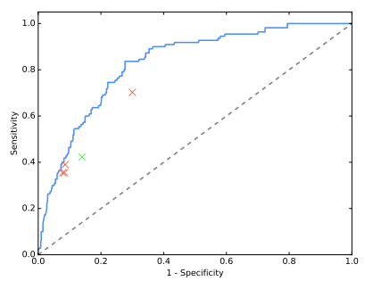
The outlier is miles away from the other 3 in ROC space (although possibly “on the same curve”).
NEW INFORMATION 7: The outlier with the high F1 score is the thoracic sub-specialist radiologist. The other 3 are general radiologists. It is certainly plausible that the more experienced reader will have a much higher F1 score, but this claim is hard to be confident about; there is only 1 data point!
I’m also not sure that the outlier on the ROC curve is the same radiologist … Pranav did say at one point that the ROC outlier was a less experienced doctor so I think they are different. In which case we have two outliers on two different metrics, which goes to show how metric choice can make the results look very different.
How to deal with this is a very tricky question. There is no hard and fast rules here … we could exclude the outlier, but given there is reason to believe this will be the best performing radiologist, that might be unfair. It would also leave us with only 3 data points, which is starting to feel very sparse.
One principled way to deal with this is to assess the partial ROC curve (and AUC) of the model and the clustered doctors in the region of the data, ignoring the outlier.

Zoom! Enhance!
This is a rough attempt at a partial AUC (pdf link explaining partial ROC curves in a fairly math heavy way – I haven’t been able to find a simple primer on the internet so unless my readers can point me to one, I’ll have to add that to my to-do list). The grey area is the doctors AUC (using a hand-drawn convex hull 🙂 ) and the light blue is the area under the model ROC curve that is above the doctors. The blue area reflects how much “better” the model is. In this region the difference looks to be about 1/15th of the total area if we exclude the outlier, and more like 1/6th if we include it. This is pretty good evidence that the outlier is significantly altering the performance comparison.
Unfortunately we can’t really do this partial AUC method either, because there aren’t enough human points in ROC space to make a real convex hull. This is the crux of the problem; there just aren’t enough doctors to make a strong argument. In my own work, I have seen a pretty big variation between doctors of the same “expertise” level, and F1 scores can vary pretty wildly. Basing the first ever claim of superhuman AI performance in medicine on the results of 4 doctors seems a stretch.
SURPRISE!!!
I said there might be a surprise, and here it is. It sure surprised me.
Despite the few (fairly minor) misgivings I have about this work … I believe the results. Taking a dataset with poor accuracy, training a deep learning model on them, and then applying them to data with a better ground-truth (even if they are a bit ill-defined) … works.
At the very least, the system is about as good as humans at the task.
This ability to ignore bad labels (often called label noise) is a known property of many machine learning systems, and deep learning in particular seems good at it.
I quoted Jeremy in my last piece on the topic, and I’ll put it back here again. I didn’t disagree at the time (feel free to check my responses on Twitter), but it is worth pointing out that the data in this paper does strongly support Jeremy’s view.
It is undoubtedly true that label noise is always a negative, but how much of a negative depends on how much noise there is and how it is distributed. In many situations deep learning will do nearly as well with low quality labels as it does with perfect labels. This is great for teams who are facing huge costs to gather large datasets, but it shouldn’t lead to complacency. The better the labels, the better your results. There is a trade-off between labelling effort and performance that is going to be asymptotic, but even small improvements can make or break medical systems.

Something like this, with test performance on the y-axis and years of effort on the x-axis.
That said, the sheer resilience to bad labels shown in this paper might suggest we need to update our meme. Maybe “garbage in, garbage out” should become “garbage in, cabbage out”.
Edible, but not 5-star dining 🙂
THE CONCLUSION
That was a whole lot of words saying a whole lot of things, so what is the summary?
I think these results are probably right.
Things I am convinced of:
- The CXR14 dataset has labels that don’t really match the images. This study supports what I said before.
- For detecting pneumonia-like image features on chest x-rays, this system performs at least on par with human experts. For all of my criticisms above, this is very plausible. I’d be happy to accept this claim at face value.
- Pranav and team are great 🙂
Things I think are probably true, but I’m not convinced of:
- That this system is superhuman. There are several minor issues with the statistical analysis and not enough doctors/data points for me to truly accept this claim given how close to 0 the confidence interval is.
- The system learns to match good quality image labels despite the flawed training data. This is very interesting, but without seeing the results in the other classes it is hard to be sure that the pneumonia result is not an outlier. Even if it is true, there is no doubt in my mind that the performance would be better with cleaner training labels.
Things I would personally prefer were different:
- Keep the ROC curve, add a few more metrics.
- Do some sort of outlier analysis.
- More doctors!
So there we go. A long process, but it is nice to be able to finally answer the questions I get about the paper.
And I finished just in time for the online Radiology Journal Club organised by Dr Judy Gichoya of Indiana University Hospital, where a panel of us will be discussing the paper tomorrow. The panel will include two members of the CheXNet team (Pranav and Matt Lungren, a radiologist), Jeremy Howard (ex-Enlitic, Kaggle, fast.ai), radiologist and informaticist Paras Lakhani (from the blog I referenced at the start), data scientist and radiologist Raym Geis, and myself. You can sign up here to listen in.

Great reading, thanks for the in-depth analysis. Hoping to see carefully crafted CXR studies with more doctors and bigger datasets in the nearest future.
LikeLike
> A 95% confidence interval says “if you reran this experiment with new test data, 95% of the reruns should be in this range”.
This is not really a correct statement. Unfortunately these frequentist concepts are highly unintuitive and cannot be stated in a handwavy way without causing lots of confusion.
A correct version would be: if you reran this experiment many times with different test data and generated a confidence interval each time, then 95% of the confidence intervals would contain the true underlying value that we’re trying to estimate.
We cannot claim anything about one particular confidence interval. This is inconvenient and difficult to interpret but that’s how it is.
LikeLike
Yeah, absolutely true. I was a bit rushed when I wrote this, due to the deadline of the panel. Thanks very much for the correction.
LikeLike
Hello,
Really nice and thoughtful analysis, pleasure to read!
but I am still not convinced that just relabeling the test set is enough, this alone can never mitigate the systematic bias (structured noise) in the dataset you explored in Part 3 here:
https://lukeoakdenrayner.wordpress.com/2017/12/18/the-chestxray14-dataset-problems/
in fact, as I understand from your article, there is no big difference from thier work (hand labeled test set) and what you did (examining test results by eye) given the same training and validation set (since you also grouped similar labels, unless their grouping method is different and more subtle)
I would have been convinced if they hand labeled a *Validation* set, the model can overfit to it to overcome the structured noise in the training set (I have done this before and a clean validation set works great in overcoming many types of noise in the training data). But only cleaning the test set can’t cut it.
hope you can clarify this point more
Regards,
Mohamed
LikeLike
Hi Mohamed, thanks for the comment.
I think there are really only two possible interpretations of this data:
1) the model generalises to a more clinical task (albeit the task has limitations that I describe in the piece).
2) the apparent generalisation is a random fluke, and repeated experiments would show that the model does not generalise to the defined task.
Using a hand labelled validation set would presumably work better than the current method, although it should still work worse than cleaning the entire training set. I really see the validation set as a “second order” training signal anyway, and like you say it is probably a very efficient way to obtain a good training signal.
But in this paper I can’t see any other explanations for being able to perform “well” on the test set.
Cheers,
Luke
LikeLike
Hi Luke
Type before “its a big claim”?
Cheers
Zak Safra
LikeLike
Hi Zak, I’m not sure what you mean. Is there a typo?
LikeLike
Hi Luke,
Great write-up! I was wondering if you had any general tips for best practice (i.e. due diligence) when applying deep learning to medical imaging?
Some of my initial thoughts are:
– Clear criteria for success outlined before experiments (possibly created by a third party)
– Failure analysis on a large test/validation set
My biggest question would be how to collect the ground truth annotations for the train and test sets, how many different annotators should we use, and should the test and train set have different annotators? Is it reasonable to use a single annotator?
Best,
Will
LikeLike
Luke, I loved this piece…It also forced me to go back to my honours stats and restablish my underlying stats understanding!.
Anyway the key for me was the observation that noise in a dataset is not necessarily a death blow. One of the big issues in melanoma (all skin lesions actually) data sets is the level of noise (poor labelling)…It is good to start to see that this might be ok depending on % and distribution.
I assume you are all over this nature paper also from stanford.
I am making progress on my little project..Have now spoken to Dat61, Head of google cloud Health in the US, Skin vision, skin view, mole map amongst others and just about to sign up a PhD student to do the desk based global scoping on what is best of breed in this space.
Anyway I’d love to be able to get your input and help from time to time if that was ok. I realise you are a tad busy in your own space.
rgds Daniel
á§
*Daniel Petre AO*
*Co-Founder and Partner*
*AirTree Ventures*
*a: *120B Underwood St Paddington NSW 2021
*m**: *+61 412 345 591 *s: * dpetre59 *e: *daniel@airtree.vc
*t: * @airtreevc *w: *www.airtree.vc
On 24 January 2018 at 22:11, Luke Oakden-Rayner wrote:
> lukeoakdenrayner posted: “I little while back I analysed the CXR14 dataset > and found it to be of questionable quality. The follow-up question many > readers asked was “what about the papers that have been built on it?” There > have been something like ten papers that used this dataset” >
LikeLike
A comment about the comparison procedure:
“Now, they compare each doctor against each other doctor individually, and average the results. This is better, they will now get 50% correct in the above situation. CheXNet is tested in the same way, against each individual doctor and averaged. The comparison is now apples to apples.”
Say there are 4 radiologist. So for the algorithm we take the average over 4 numbers (its F1 score vs each radiologist serving as ground truth). But for each radiologist do we average over 3 numbers (the other radiologists) or over 4 numbers (the other radiologists + the algorithm)? According to the explanation above it’s the former. According to the paper it’s the latter:
“We compute the F1 score for each individual radiologist and for CheXNet against each of the other 4 labels as ground truth. We report the mean of the 4 resulting F1 scores for each radiologist and for CheXNet, along with the average F1 across the radiologists.”
LikeLike
and another comment about the F1 score: it’s roughly the average between sensitivity and precision, (not sensitivity and specificity).
LikeLike
More precisely, it’s the harmonic mean of the two.
LikeLike
In my papers, when describing what is being detected by a learning system in radiology, I always try to use the term “patterns”, e.g., “pneumonia patterns” or “interstitial lung disease patterns”. What do you think of this nomenclature?
LikeLike
Do you think it would be worthwhile to address this in a letter to PLOS?
https://journals.plos.org/plosmedicine/article?id=10.1371/journal.pmed.1002686#sec016
LikeLike