

Deep learning research in medicine is a bit like the Wild West at the moment; sometimes you find gold, sometimes a giant steampunk spider-bot causes a ruckus. This has derailed my series on whether AI will be replacing doctors soon, as I have felt the need to focus a bit more on how to assess the quality of medical AI research.
I wanted to start closing out my series on the role of AI in medicine. What has happened instead is that several papers have claimed to beat doctors, and have failed to justify these claims. Despite this, and despite not going through peer review, the groups involved have issued press releases about their achievements, marketing the results direct to the public and the media.
I don’t think this is malicious. I think there is a cultural divide between the machine learning and the medical communities, a different way of doing research, and a different level of evidence required for making strong claims. If I have to be honest, I think the machine learning community has a fair bit to learn from medical research in this regard.
So today, I’m going to reprise one of my most popular blog posts. Last time I made a set of three rules about how to assess medical AI research, and the third was a glib recommendation to “actually read the paper”. The problem is that I didn’t explain how to do that, and what common problems you might look for.
So I want to go into a bit of detail about what sort of things you might look for when assessing these sort of claims. The same rules should be valuable to anyone working in medical AI, especially if they are making a medical claim. It might even be useful more broadly, as we explore how to be more rigorous in testing machine learning systems in practice.
Like last time, we should end up with some rules-of-thumb to apply to any future papers you come across.
Machines at least equal doctors, sometimes
If you have been following my blog, you would know that I wholeheartedly agree that two papers have shown human-level performance. Those are the Google paper about retinopathy assessment, and the Stanford paper about dermatology assessment. These papers make justified claims about their performance.
For almost a year since those papers, no-one published new “breakthrough” results. But since November 2017, quite a few papers were published in quick succession that make these sort of claims. In the interests of full disclosure, one of these papers was mine. I’m not going to comment on our paper today, other than to say I stand behind the methods and analysis. I also point out that we have not courted any media attention with our work, and we will not until we have a paper through peer review. But since I am a big fan of open peer-review, if readers have any issues with our paper, please contact me here, on Twitter, Reddit, or via email.
I really like at least one of the other papers. Several of the other papers … have issues. I’m not intending to really analyse these papers in depth, but instead look at some ways they have measured performance for their systems, and suggest some possible improvements.
The first important concept to address is how we deal with something called ROC space, and the second is the issue of statistical significance.
I will start with the most problematic paper first, and since this piece will focus on the ROC curve, I have to thank my colleague Professor Andrew Bradley for his editing and brainstorming assistance in this piece. He happens to be an expert on ROC curves, and he has certainly stoked my interest in their nuts and bolts.
So, onto the first paper and the topic of ROC curves. If you spend time in the medical AI Twitter community, you have already heard about DeepRadiologyNet: Radiologist Level Pathology Detection in CT Head Images. Let’s have a look at it.
We will, we will, ROC you
DeepRadiology released their paper just prior to RSNA, the largest conference in the world and the hottest hotbed of “AI in radiology” keynote speeches and startup hype. They had a booth there, and to give credit where it is due, as far as I know they were the only one of many deep learning startups willing to back up their booth PR claims with actual data. For further kudos, they took a really good approach to the problem. They gathered something like 55,000 CT head scans from over 80 sites, and their test set of 30,000 CT heads was labelled by a combination of “outcome analysis” and agreement between 2-5 radiologists. A huge task, and absolutely the right way to go about things.
Unfortunately their paper is flawed, and the results are not great. John Zech, a medical student an Mt Sinai, explains why. Instead of repeating his critique, I want to explain the basis for it.
What the criticism really boils down to, is the ROC.

A critical eye in the planning phase could solve all your Roc(k) related bad decisions.
The term receiver operating characteristic (ROC) space is a mouthful, and uttering the phrase is a sure way to generated glazed eyes among the non-statsy folk. But it turns out that it is actually really simple.
Every decision we make is a trade-off. We don’t know the “right” choice, so we have to minimise our chance of being wrong. But choices have two ways to be wrong:
- you decide to do something when you shouldn’t have
- you decide not to do something when you should have
These are the two elements of ROC space.

Ignore either part of the Roc at your peril.
Let’s use an everyday example: you are trying to pick somewhere to eat. If you only go to places you have enjoyed in the past, you won’t have many bad meals but you also won’t experience some cool places. If you randomly choose where to go, you could have lots of terrible meals, but you will also find some gems that you might otherwise miss out on.
The first method has a high false negative rate, meaning you dismiss lots of places that you could have liked. It also has a very low false positive rate, because you will rarely go to a place that you don’t like.
The second method is the inverse, with a low false negative rate and a high false positive rate. Every person has a different balance of these two rates; some favour trying new things, others prefer sticking with what they know, others are in the middle.
If these terms are new to you, take a second to think them through because they are foundational to performance testing. To restate the definitions, a false negative means you called something negative (don’t go), but in reality it was positive (should have gone, you would have liked it). A false positive is the opposite; you called it positive (so you tried it), but you shouldn’t have (because you didn’t enjoy it).
The important thing here is that for any given decision making process, these errors balance each other. If false positives go up, false negatives will go down, and visa versa.
ROC space is a way to visually define this trade-off*.
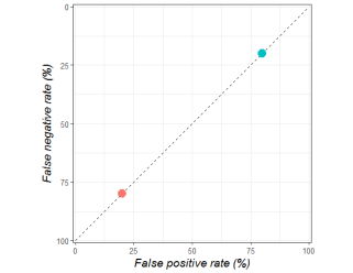
The orange dot shows a person who only goes to the same places (they have bad meals 20% of the time, but miss out on 80% of good restaurants). The blue dot is someone who tries new things (they have bad meals 80% of the time, but only miss out on 20% of good food experiences).
So far so good, hopefully. But ROC space is far more interesting than this, because it can also show us how good a decision is. The chance of you being happy with a food decision is not only decided by how you trade off the two types of error, but also by how accurately you can identify a good eating place.
I’m not going to go into detail here, although I will link some great papers at the bottom, but just trust me when I say that any point along the dotted diagonal line above means that the decision is only as good as a random guess.
These decision makers are trading off false positives and false negatives in different ways, but all are equally bad at making decisions. They are only as good as a random guess.
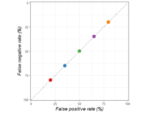
You can do much better than chance when picking a place to eat. You could ask your friends, pick a place that serves a cuisine you generally enjoy, look at reviews, and so on.
When you start making better decisions, your position in ROC space will move up and left. And this has the interesting property of making the trade-off between false positives and false negatives form a curve. This curve is, somewhat unsurprisingly called the ROC curve, and is equally meaningful for sets of decision makers (for example, a range of experts) or single decision makers (such as a person who is consciously varying their false negative and false positive rates).
The point you choose to balance false positives and false negatives is called the operating point, which is part of where the receiver operating characteristic curve gets its name. Another name for this is the threshold, which might be more intuitive. Someone who minimises how many bad meals they eat will only trust restaurants they already like; they have a high threshold for making a decision. A person with a low threshold is willing to try anything, they have no filter.
The grey area tells us how good a decision maker is, independent of how they balance false positives and false negatives. The more grey, the better the decisions.
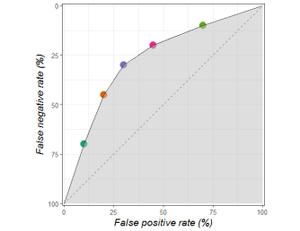
Since the further to the top left you are, the better your decisions are, the area under the ROC curve, otherwise known as the ROC AUC or AUROC, is a great metric to understand how good your decisions are.
Now, the even more interesting thing is that all of the points below this curve are dominated by the decision makers on the curve. This means the points below the curve are objectively worse at making decisions; the decisions have a lower probability of having the outcome we would prefer. In our example these points might reflect the times when you can’t be bothered checking online reviews, and operating at these points mean you would be happy with your choices less often.

One very interesting feature of human expertise is that people of similar skill may make completely different decisions about their threshold, but they typically sit on the same curve. In some way, the quality of their decision making is similar, even when the actual decisions can be very different**.
For example, the papers from Google and Stanford I mentioned earlier. All of the coloured dots reflect human experts. You can see that they are all roughly on the same curve, despite having significantly different false positive and false negative rates.

If it is confusing you, just ignore the fact that Stanford flipped their axes. It still has all the properties of a ROC curve.
In these pictures, the dots are the humans. The curved lines, on the other hand, are the AI systems. Algorithms have the cool property of having explicit, numeric thresholds (i.e. a number between 0 and 100). A threshold of 0 means that every case is called positive regardless of how certain the algorithm is, so you will have zero false negatives. This point is at the top right of ROC space. A threshold of 100 means all cases are called negative, so you have zero false positives and live in the bottom left corner. Again, if you haven’t come across this concept before, take a second. It might seem reversed at first glance to have the low thresholds at the top right and the high thresholds at the bottom left, but it makes sense when you consider the two types of error.
The cool thing here is that unlike humans, who struggle to move in ROC space and alter their threshold^, AI systems can easily and predictably move from a low false positive rate to a low false negative rate, and will always stay on their ROC curve.
So that is a quick primer on ROC space. Take home points:
- All decisions trade-off the risk of false positives and false negatives.
- ROC space is how we visualise this trade-off.
- Decision makers (i.e. people, AI systems) live at a certain point in ROC space, although they can move in the space by changing their threshold.
- Better decision makers are up and to the left in ROC space.
- Multiple decision makers of the same skill or expertise tend to live on a curve in ROC space, which we call the ROC curve. This is true of groups of decision makers, and of a single decision maker at different thresholds.
- The area under the ROC curve is an overall measure of how good a system is at making decisions independent of decision threshold. This can be seen as a measure of expertise.
- Decision makers below the curve are suboptimal.
Why so sensitive?

Dubious expression indeed.
Which brings us to DeepRadiologyNet.
They ignore the trade-off, which I think is the critical point about making decisions. They claim a very low false negative rate (which they call a “critical miss rate”), but do not mention their false positive rate.
To understand why this isn’t ok, let’s look back at our first ROC curve.
Hopefully you can see the problem. A decision maker that just gives random guesses can still achieve a near zero false negative rate, just by having a very low threshold and living at the top right of the dotted line. It is both trivially true that all decision makers can do this, and essentially meaningless.
In the paper they try to say they will only make diagnoses under this threshold, which limits their system to reporting on 8.5% of the cases. In theory, this is a possible way to run an AI system, but if you are comparing the system against humans it needs to be a fair match-up, tested on the same 8.5% of (presumably much easier) cases. Instead they compare this to humans acting on the entire set of cases. John Zech explains the flaw in this logic:
“If I could count only my best 8.5% of free throws, I would be better than any player in the NBA.”
To compare the quality of their decision making system to a human, in a way that balances false positives and false negatives, it would be better to do what Google and Stanford did and show us both on a ROC curve. Thankfully, they do give us a ROC curve for their model (without a human comparison), as well as an estimated false negative rate for humans. With a bit of wrangling we can work out a false positive rate from their estimates. Not getting into whether this is a valid estimate, they put humans at a FNR of 0.8% and an FPR or 0.4%, shown as an orange square on the chart below.

So humans are at the very top left, and the system is somewhere in the middle of ROC space. It is pretty clear already that the system is completely dominated by humans. But since we are trying to compare a point to a curve, how can we quantitatively assess the difference?
The meanest of averages
This is actually where I disagree (very mildly) with the methods in the Stanford dermatology paper. You see, they calculate the average false positive rate and false negative rate among all of their test doctors (there are about 20 of them), and they call this “average dermatologist”.

While this seems sensible at first glance, you might notice something if you look closely. The average is inside the curve of dermatologists. Because ROC curves are, well, curves, an average across both axes will inherently be inside the curve, and therefore dominated by all points on the curve (with a few exceptions in pathological ROC curves).

A more clear simulated example. The pink spot is the “average”, which is clearly pessimistic when estimating the performance of the decision makers.
So, what methods might be better? Well, you could calculate the average FPR and FNR of the AI system ROC curve, although this can still be a bit off. Alternatively, and this is my preferred method, you could make a ROC curve out of the human points by joining them up, and compare the area under each curve directly. Without going into details, the most justified method is probably something called the ROC Convex Hull.
The only real limitation to using the convex hull is that you need a minimum of five points/ experts. Since human performance varies a lot (as you can see with the spread of dots in the papers), if you don’t have at least five experts to compare to you probably shouldn’t be making very strong claims about the comparative performance of your AI system anyway.
As an aside, the alternative to a convex hull is to make each human expert use a Likert scale and give a score to describe their certainty about a diagnosis (i.e., 1 = definitely not, 2 = probably not …). As long as you have at least 5 levels to the scale, you can make a ROC curve for each expert and then average the AUC values instead. I’m a little uncomfortable with doing this because humans aren’t usually experienced with using scoring systems, but in the right setting this can be perfectly valid.
In the dermatology paper, we would get something like this with a convex hull:

Instead of the average point being below the ROC curve, the area under each curve (human and AI) is essentially the same, probably around 0.94.
The reason this doesn’t matter in the derm paper is that they don’t claim to beat doctors. They claim their system is “comparable to dermatologists”. This claim is clearly justified, even by a rough eyeball of ROC space.
But let’s do the same with the DeepRadiologyNet paper. We only have one point, so we will have to use some artistic license (since we don’t have 5 points to form the hull).

They don’t report an AUC, but it looks around 0.75, whereas the human AUC must be over 0.995. This is a very different picture from the results presented, and quite clearly no claim of human equivalence is justified.
What about the other metrics?
So far, I have just talked about ROC space and AUC. These are great metrics, because they in some sense quantify expertise, which is something we would love our AI algorithms to obtain. They also show us the trade-off between false positives and false negatives, which is nice, although it doesn’t really add anything to our ability to judge the performance of the system. We already know the trade-off looks like a curve.
But what ROC space does not tell us is how often the system will be right in practice.
This is because the ROC curve is prevalence invariant. This means that the curve will not change based on the proportions of positives and negatives in the data. The curve will look the same regardless of whether 90% or 10% of restaurants are enjoyable. What changes is the number of false positives and false negatives you will produce.
A random guess will result in a good meal 90% of the time if 90% of restaurants are good. Likewise, you will have a ton of bad meals if restaurants are only good 10% of the time.
The kicker is that in medicine, most diseases are rare. The prevalence is usually below 10%, and can be lower than 1 per 1,000,000. This means that medical diagnosis has a problem with false positives. Even if your test only gives one false positive per hundred cases, if the prevalence in the test population is 0.1% you will have at least ten times as many false positives as true positives^^, and only 10% of patients diagnosed with the disease will actually have it!
I want to be clear: this doesn’t actually alter the comparison against humans. Humans also have to deal with low prevalence diseases. The ROC curve comparison is still fine. But for a reader of a paper, who may or may not have expertise in the area, it doesn’t tell the whole story.
The FDA just released a new document that suggests a set of metrics to present for AI studies. As reported by Hugh Harvey (another radiologist and blogger):
I probably have a slightly different take here. Sensitivity and specificity are always useful, they are just the FPR and FNR values at a single operating point on the ROC curve. We have to show this, because when we apply an AI system to patients you need some threshold that differentiates “disease” from “not disease”. Choosing a threshold is required if we have to make decisions.
I wouldn’t say the odds ratio is a requirement, because it doesn’t seem to add much beyond sensitivity and specificity. The only thing I can see, is that it is interpretable. You can look at an odds ratio and say “a positive test has 3 to 1 odds of being a true finding”. This benefit is rapidly eroded when we realise that people confuse odds ratios, risk ratios, and likelihood ratios all the time.
I think there are definitely times when you want to use an odds ratio, but it isn’t a necessity for every piece of medical AI research.
What we need to know is how many errors a system will make in a clinical population. For this we need the prevalence of disease in the data, and in the clinical population. Even more than that, researchers just need to describe their test set fully. Google did this really well in the retinopathy paper, in the chart below:

Readers can easily identify how many patients have disease, how many were excluded from study (which tells us how broadly applicable the system might be) and even how the diagnosis was changed by their “gold standard” of majority vote. You can see, for example, that the EYEPACS-1 validation set excluded 1/10 images, which might mean we put more value on the MESSIDOR-2 data (since it excluded far fewer). We can also easily see that MESSIDOR had slightly higher prevalence of RDR. All things a reader might want to take into account. So, if you write medical AI papers, please do describe your data and the clinical population!
The other thing which would be nice to see, which the FDA do mention as part of “analytic validation” is the precision (otherwise known as the positive predictive value). The usual description is “for every case the decision maker calls positive, how many are actually positive?”
I think of this metric as the false positive rate if it took prevalence into account. If a disease has 50% prevalence, then precision and specificity are usually pretty close to each other. But if the prevalence of disease is lower, the precision can drop dramatically while the specificity does not change.
Now, if we have the specificity and the prevalence, working out the precision is just a bit of mental gymnastics. I just don’t think we should ask our readers to do those gymnastics 🙂
There are a bunch of other metrics that get used (which I will probably talk about more another time), and many have a place in research when you know why specifically to use one over another. But for simple rules of thumb, my take on performance analysis in diagnostic AI is thus:
- Always show the ROC curve, and put the baseline/gold-standard/doctors in ROC space as a visual comparison.
- ROC AUC is a good metric to quantify expertise.
- Human experts don’t have an AUC, because they are individual points in ROC space. If you have more than 5 humans in your test, make a ROC curve out using the ROC Convex Hull, and compare AUC directly. If you have less than 5 experts … you probably shouldn’t be making definitive claims in the first place. Note: you can also make human ROC curves if it is appropriate to test humans on a Likert scale.
- The “average” of human sensitivity and specificity is pessimistically biased against humans if you compare it to an AI’s ROC curve. Don’t use it!
- If you are claiming your system is “better” at diagnosis than a machine, and you aren’t doing a proper ROC analysis, you are doing it wrong.
- If you are trying to show how your system would be used in practice, you must choose an operating point and present the sensitivity and specificity of your model at that point.
- It would be great if you also showed precision, given that the disease you are looking for is probably low prevalence. Precision is nice and easy to understand in a medical context; what percentage of people diagnosed with a disease actually have it.
- This isn’t a metric, but if you don’t describe your data properly, none of your readers will be able to assess your claims at all. Give us prevalence in the test and clinical population, exclusions, and even demographics if you have it.
- In general, copy the methods in the Google paper on retinopathy 🙂
So there you go, my take on ROC and performance metrics, with a bit of discussion around the DeepRadiologyNet paper. Hopefully it is useful. In case you didn’t realise, I am pretty interested in ROC curves. As I mentioned, one of my colleagues is a ROC expert and it has rubbed off 🙂
Part two of this piece will look into another aspect of medical research that is less widely considered in machine learning: significance testing. This is pretty topical, given the recent brouhaha about “statistical rigour” at NIPS (the biggest machine learning conference).
I’ve really only scratched the surface of the beauty of ROC curves, so if you want to know more here are some seminal papers (warning: direct pdf links):
Anything by Tom Fawcett (not a pdf link).

Would be good to look into DBM MRMC analysis.
LikeLike
Very well written article!
I wonder why average precision and/or mAP is not common metric to use in this space to measure performance with imbalanced data? It’s standard metric in the field of object detection and recommended system.
LikeLike
I’m writing a follow up that should cover that, I think. Thanks!
LikeLike
I am happy to see the discussion about disease prevalence and false positives/true positives. One worthy aspiration — which was discussed in a TedTalk by one of the dermology study authors — is to use AI in a consumer-oriented approach. For example, where dermatologist are not available. This typically implies use in a very low prevalent setting. Most algorithms in medicine are developed and validated in high prevalent settings. Increasingly AI algorithms aspire to be deployed population-wide. You would need to set algorithms thresholds to essential work at the point of 100% specificity – which is great and means they would act more like screening tools than diagnostic tools (no problem).
We teach that ROC curves do not change in different prevalent populations, but in practice that often does not hold. I suspect that the specificity of many algorithms will improve in low prevalence populations without an erosion of sensitivity.
All this is to say that algorithms should be assessed in the same setting where they are intended to be used. As recommended, algorithms should ideally be assessed whether they change practice. That very rarely is performed, but another discussion….
LikeLike
Yes, agree with all of that, thanks for the comment.
I’d quibble about the idea that prevalence changes roc curves. My take is that this is mathematically impossible but in very low prevalence situations you run into sampling issues. If you have a thousand negatives and five positives, the roc curve will be different than if you have a thousand negatives and a hundred positives, just because the five positives are unlikely to reflect the true population. N is too small. If the n of each axis is above 30 or so, the roc curve should be pretty stable.
Changing practice is the most important part! No-one has done it yet with diagnostic AI. Another future blog post, for sure.
LikeLike
Changing sensitivity and specificity is not only a product of the algorithm but also characteristic underlying population — and other factors. Image classification algorithms have lower effect from population characteristics than other algorithms. But I expect that changes in the sens and specificity are the norm even for these algorithms.
In the examples in your post, sensitivity and specificity may actually be higher in practice – but it is hard to know without studies that validate algorithms in the real-life setting. This should be the normal practice but almost never happens.
Consider the skin cancer algorithm in your post: validation data was 130 images from a reference collection. Of those 130 images about 30 were melanoma. I suspect many/most other images represented an “interesting” collection of lesions that do represent the distribution of lesions in the general population. In the general population, the incidence of melanoma is about 10/100 000. 100 000 people probably have over a million skin lesions of which the vast majority are nice regular edge, uniform color nevi. The algorithm worked hard (and performed well) to discriminate melanoma from irregular nevi, etc. in the sample population. The task is likely easier in the general application population. Sensitivity and specificity in the development and validation data were eroded when faced with those irregular nevi, irregular seborrheic keratoses, etc. The *proportion* of those challenging lesions will be different (lower) in practice, which will affect the sensitivity and specificity in practice.
Frank Harrell talks about these issues in his Statistical Thinking website. For his New Year goals he stated, “Medical diagnosis is finally understood as a task in probabilistic thinking, and sensitivity and specificity (which are characteristics not only of tests but also of patients) are seldom used”. http://www.fharrell.com/post/new-year-goals/ He might be taking it a little far but his point is well taken.
LikeLike
Remarkable things here. I’m very glad to look your article.
Thanks a lot and I am having a look forward to contact you.
Will you kindly drop me a e-mail?
LikeLike
Any update on new papers from 2018-2019 that achieve true human-level performance?
LikeLike