

A couple of weeks ago, I mentioned I had some concerns about the ChestXray14 dataset. I said I would come back when I had more info, and since then I have been digging into the data. I’ve talked with Dr Summers via email a few times as well. Unfortunately, this exploration has only increased my concerns about the dataset.
WARNING: there are going to be lots of images today. If data and bandwidth are a problem for you, beware. Also, this piece is about 5000 words long. Sorry 🙂
DISCLAIMER: Since some people are interpreting this wrongly, I do not think this piece in any way reflects broader problems in medical deep learning, or suggests that claims of human performance are impossible. I’ve made a claim like that myself, in recent work. These results are specific to this dataset, and represent challenges we face with medical data. Challenges that can be overcome. Next blog post, I will explain one way to overcome them.
I don’t want to bury the lede here, so I will say this up front. I believe the ChestXray14 dataset, as it exists now, is not fit for training medical AI systems to do diagnostic work. To set my argument out clearly, there are specific problems I want to discuss with:
- how accurate the labels are
- what the labels actually mean, medically
- how useful the labels are for image analysis
Most of this piece will be justifying my position, but first I want to talk about the paper that introduced the dataset. I should point out that both the paper, and the supporting documents for the dataset, have been updated multiple times since the original publication. They have actually been updated at least twice since I started talking to the team, including yesterday. I have looked through the documents and as far as I can tell all of my statements below are still appropriate*.
In my opinion, this paper should have spent more time explaining the dataset. Particularly given the fact that many of the data users will be computer scientists without the clinical knowledge to discover any pitfalls. Instead, the paper describes text mining and computer vision tasks. There is one paragraph (in eight pages), and one table, about the accuracy of their labeling.
The text mining performance results in the table below are actually from a supplement that was included after the paper was published at CVPR:

This shows several things. The original results they presented (in the upper portion of the table) are tested on the public OpenI dataset, which has both reports and human created report entity labels. For example a report that says “there is basal consolidation” will have a tag “consolidation/basal”.
The lower part is in their own dataset, and this test has been added since publication. To make this test set they randomly selected 900 reports and had two annotators (which I assume were experts/radiologists) label them with the 14 disease classes by agreement. It is important to note here that these annotators did not look at the images (as far as I can tell).
The table shows really good results in almost all classes, particularly on their own data. The only obvious limitation here is the prevalence of each class, many of the rarer conditions have a prevalence of 1-3%, so assuming there was no significant bias in the random selection then many of these findings will have 10-20 examples in their test set. This isn’t a problem, per se, but the error bars on these measurements will be wider than if they had more data (for between ten and thirty samples in a class, given only a single error, the lower bound of a 95% confidence interval on positive predictive value will range between 75% and 88%).
But allowing for some leeway in values, the labels appear to be 85-99% accurate for each class. Accurate at reflecting the reports, at least
Always look at the images

Radiology! Come for the fun, stay for the degenerative neck disease.
Unfortunately, it seems that the labels do not accurately reflect the cases. I’ll get in to some possible reasons in a bit, but let’s look at how I came to the conclusion.
I looked at the images.
For those who don’t know, I am a radiologist. I’m not going to be any better or worse at looking at x-rays than any other radiologist, but I hope I am better than not looking at the images at all. The NIH team do not state that they reviewed the images. They judged the performance of their image labeling process by testing whether the labels matched their report text. I think this degree of separation has lead to the problems I am raising.
There are ways to build image labels without needing the images. You can rely on pre-existing labels like ICD codes, you can extract them from reports or other free text, you can use follow-up data.
But you must (absolutely, definitely, 100% please do it, must) look at the images. In computer science they talk about “sanity checks”; a simple way to test that a piece of software is functioning as intended. In deep learning we look at training curves, check the gradients, try training without regularisation to see if we can overfit. Looking at the images is the sanity check for radiology – you look at them, and make sure they are coming out as expected.
They don’t have to be perfect. If you are incorporating information that might not be on the image itself (like follow-up data) for example, then maybe there will be visually occult disease. That is fine, but you should still look at the images.
It might be hard to pin down exactly how you would define your classes based on visual information alone, like what the cut off might be between a normal heart and an enlarged heart. That is fine, but you should still look at the images.
Just set aside a small random subset for each class, I’d recommend at least 100. You can even be rough with your assessment of them, so it doesn’t take very long. I usually get through about 200 images in 10 minutes in the early part of “sanity checking”. It doesn’t need to be perfect. That is fine, you should still look at the images.
Because if you don’t look at the images, things can go bad.
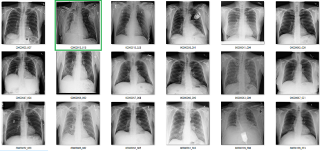
Part 1: Visual label accuracy in ChestXray14
What follows is a bunch of pictures based on the labels in the dataset. In this case, they are pseudo-random. Like I said, it doesn’t have to be perfect. They are randomly chosen sequential sets of 18 images. They are not cherry-picked.
Also, I have tried to err on the side of caution, in the sense that I favour the label class when a case is equivocal.
In all the images, red = clearly wrong label. Orange = I doubt it, I wouldn’t report it, but I can’t really exclude it. Correlate clinically :p
Atelectasis

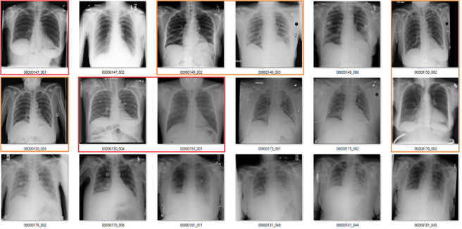
Cardiomegaly


Fibrosis


My labels aren’t perfect. Other radiologists will disagree with some of them, and the reduced resolution doesn’t help. But it should be clear that my labels and the results presented in the paper/supplement are vastly different.
I always like hard numbers, so I did my best to quantify the label accuracy where I can. I actually found it very hard to define many of the labels, which is why they are not listed below. I reviewed ~130 images in each class, and calculated the accuracy of the original labels according to my visual interpretation. This is a pretty good amount of data to use, as the 95% confidence intervals will probably be less than +/- 5%, even allowing myself up to a 20% error rate.

Visual analysis by me. Text mining results from the paper.
Again, I doubt my labels are “right” compared to some form of fairly reliable ground truth (like a panel of chest radiologists), but the difference here is stark. I think that these findings make a strong case that these labels do not appear to visually match the diseases they should represent.
There is a counter-argument. The radiologists who interpreted the images originally had non-imaging information to assist them. This is true; they have a clinical history, previous results, and so on. These sources of information can be very useful, particularly in distinguishing between similar diseases.
Without access to the reports, I can’t really comment on the role they played here. I do know from clinical experience that these extra sources of information play a role maybe ten percent of the time, and even then they rarely make a diagnosis definitive. They nudge us a little, one way or the other.
It is also true that if human experts cannot make the diagnosis from the images alone, then an AI system probably can’t either. An AI might be able to find some subtle findings that humans miss, but it is implausible that these will make such a huge difference to performance. By and large, without clear justification, we need the labels and the images to contain the same information.
If the team of Wang et al. is claiming that their labels are better than my visual interpretation because of unavailable data, especially by such a large margin, I would like to see at least some discussion of that in the paper to explain the process. Particularly since the reports will never be released.
Part 2: What do the labels mean, medically?
This brings us to the second issue, and I touched on this in my earlier piece. What do these labels actually represent? Do they reflect clinical practice?
Again, I think the answer is a pretty clear no.
The most difficult to parse labels are the consolidation / infiltration / atelectasis / pneumonia grouping. I discussed this last time, so I won’t revisit it here, other than to say that it still confuses the heck out of me. Despite spending a fair whack of time looking at these images, I am no closer to being able to differentiate these classes.
There are other issues specific to these images as well, related to the clinical value of the tasks:
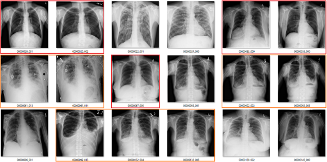
Effusion

In this case, the blue labels mean there is significant lung disease present.
An effusion is fluid in the space around the lung. The list of causes is a mile long, but the two main groups are effusions caused by pleural disease, and those caused by lung disease.
It is not clear to me what it means to identify effusions that exist with significant lung disease. In many of these cases, it is not even really possible to visually identify the effusion, we just know that an effusion must be present so we describe it. See the last three images in the picture above for a good example of this. The main pathology in those cases is consolidation, in my opinion.
I can see value in identifying small, isolated pleural effusions. There are about a half dozen examples of these above, including the first and third images. There isn’t any lung disease to suggest the cause of effusion, which makes the effusion itself significant.
I could also see the benefit in identifying large effusions that might need intervention (like draining them with a needle). The 10th image is an example of this.
So it isn’t really clear to me what this label means. Without a guiding philosophy based in clinical practice, it isn’t very useful.
Pneumothorax
A pneumothorax is when there is air in the pleural space around the lung. This can cause the lung to collapse, and is a pretty serious finding. They can be really subtle on x-rays and are often missed.

At first glance, the labels look good. In these 18 cases, only the one highlighted in orange is a bit questionable, and that may just be because I am not looking at the image in diagnostic conditions.
But the green boxes are a problem. These are cases of pneumothorax where the patient has already been treated with a chest drain. There are two issues here:
- This isn’t a medically important problem. We want to avoid missed pneumothoraces, and by definition these have not been missed.
- If so many of the images have chest drains, an AI system will probably learn to identify chest drains instead of pneumothoraces. It is entirely likely that the majority of image batches the model sees will contain no pneumothorax without a chest drain.
Fibrosis
We already saw above that the fibrosis labels are low accuracy, even being generous. But again, the problem is worse. In this image, the reds are incorrect labels, but the orange labels are where I have no idea. There are pleural effusions and/or consolidation. Could there be fibrosis under that? Sure, but there is no way to tell on these pictures.
There are multiple other non-image clinical problems, for example:
- Pneumonia, emphysema, and most of fibrosis are diagnosed clinically, not on imaging.
- Up to 50% of nodules are missed on x-rays, leading us to question the value of report-mined nodule labels.
- No-one really cares about hiatus hernias, so they are only reported sometimes.
Really, each of the label classes could be questioned to varying degrees, I have just highlighted being the most questionable elements. Suffice to say, identifying a useful medical task that can be learned with these labels is difficult. Again, expert review of the images should be used to recognise these limitations.
Part 3: What good are these images for image analysis?
This is the most important part of this review. There is a major issue with deep learning in radiology, and it can be a disaster if you aren’t looking at your images.
If these labels are so inaccurate, and if the meaning of the labels is so questionable, how as the papers built on this dataset reporting decent performance? What are the models actually learning?
There was a popular paper from Zhang et al. a while back which showed that deep learning can fit random labels in training data. I don’t think this really surprised anyone who trains deep learning models, but it was held up by many naysayers (incorrectly, in my opinion) as evidence that deep learning is bad.
That is not what is happening here. Instead, we are seeing models that can learn to correctly output the ground-truth in the test set, even though the ground truth is nearly visually meaningless.

Results from CheXNet: Radiologist-Level Pneumonia Detection on Chest X-Rays with Deep Learning by Rajpurkar and Irvin et al, showing respectable performance on a test set.
Now, some deep learning advocates will argue that some level of label noise is ok, or even good.
I mostly agree with Jeremy, although it depends on the task and the type of noise. Random noise can be a decent regulariser, it can even improve performance in some settings (this technique is called label smoothing or soft labels). Structured noise is different, it adds a truly different signal that the model will try to learn. This is the equivalent of training a model to learn pneumonia, but having 10% of the pneumonia labels contain dogs.
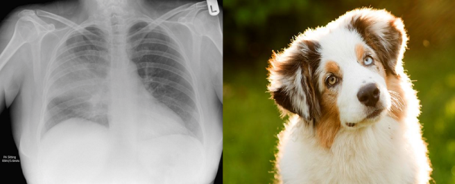
In a training set with bad labels, a neural network will treat these as equally valid examples of pneumonia. If it learns, for example, that “shagginess” is a sign of pneumonia, then it could apply that to the chest x-rays as well, with unpredictable results.
The net will use some of the “memory” it has to learn features from the dog pictures and try to apply them to the chest x-rays, despite the irrelevance to the problem.
If your goal is to maximise performance, then structured label noise is always a negative. Not necessarily a huge one (the relationship certainly isn’t linear), but biased labels hurt model accuracy.
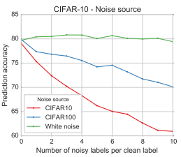
Results from “Deep learning is robust to massive label noise” by Rolnich et al, showing the drop in performance with labels corrupted by structured noise. This problem is worse when the noise is from the same source as the actual data, because the models will confuse the classes. This is analogous to the ChestXray14 dataset, where the labels are corrupted with examples that should be in other classes.
So, my intuition would be that these labels should hurt performance. This leads to the question; why is the performance on models trained on ChestXray14 quite good? Am I wrong, and the models can compensate for the data noise that is present by being “robust”?
I don’t think so. In fact, I think something far more concerning is happening.
I stumbled across this problem in the process of building a new set of labels for the dataset. I intended to use a technique called label filtering, which I will discuss next blog post.
Initially, I simplified the task** involved, by creating an “opacity” class and a “no finding” class. This essentially sidesteps some of the issues I have described earlier. I used the original labels to make this set (“opacity” was the combination of the atelectasis, pneumonia, consolidation, and infiltration labels), and trained a model on it.
As I said earlier, you don’t have to be too fancy with this kind of exploratory work. A decent model will do the job, so I just took a resnet pre-trained on Imagenet data, and retrained the deeper half of the network on the new label set. I didn’t tune any hyperparameters, and I just ran it for what seemed like a reasonable length of time. I got pretty decent performance, for not trying very hard.

AUC = 0.7
This performance is much like the group of Summers et al. in the original paper. It isn’t far off Yao et al. although it is a bit behind Rajpurkar and Irvin et al., who would probably score in the upper 0.7s on my test. I am definitely in the right ballpark, and with more effort I could probably get near Rajpurkar and Irvin et al. in performance.
My model can, definitively, learn something from these labels.
But what does my model learn?
Complete nonsense as far as I can tell. Below are the model predictions, compared against the labels in the dataset. Again, the same technique as earlier for picking images. I’m confident these aren’t cherry picked.
True positives

The green ones are the only actual true positives. The rest have incorrect labels.
True negatives


There are one or two arguable ones in the top 18, but I gave the labels the benefit of the doubt. The red ones in the 2nd 18 are all wrong.
False positives


The red ones are wrong. It also turns out that there are rotated, inverted, distorted, and otherwise abnormal images in the dataset (shown by the red question mark). More on that in the next post.
False negatives


Again, the red ones are wrongly labelled.
Despite an apparent AUC of 0.7 we get really bad classification performance, in line with the label inaccuracy. The model didn’t just ignore the incorrect labels and produce sensible predictions. It was not robust to label noise. Most importantly, the AUC value does not reflect the clinical performance.
This is a huge problem.
This AI system learned to reliably produce meaningless predictions. It managed to learn image features that create the above groups of “opacity” cases with almost no airspace opacities, and “no opacity” cases with big groups of severely abnormal lungs.
This is such a problem, because unless you look at the pictures, the results look great. Each team has progressively performed better, got higher AUC scores, so it looks like they are ‘solving’ a serious medical task.
I think this is caused by several things; medical images are large, complex, and share many common elements. But even more, the automated method of mining these labels does not inject random noise when it is inaccurate. The programmatic nature of text mining can lead to consistent, unexpected dependencies or stratification in the data. I’m reminded of the story of US army developed neural nets doing detection of camouflaged tanks in the 50s/60s.
I attended a meeting in Los Angeles, about half a century ago where someone gave a paper showing how a random net could be trained to detect the tanks in the picture. I was in the audience. At the end of the talk I stood up and made the comment that it was obvious that the picture with the tanks was made on a sunny day while the other picture (of the same field without the tanks) was made on a cloudy day. I suggested that the “neural net” had merely trained itself to recognize the difference between a bright picture and a dim picture.
Edward Fredkin, in communication with Eliezer Yudkowsky
Similarly, Dr Novoa from the Stanford dermatology paper discussed this in the media recently:
When dermatologists are looking at a lesion that they think might be a tumor, they’ll break out a ruler—the type you might have used in grade school—to take an accurate measurement of its size. Dermatologists tend to do this only for lesions that are a cause for concern. So in the set of biopsy images, if an image had a ruler in it, the algorithm was more likely to call a tumor malignant, because the presence of a ruler correlated with an increased likelihood a lesion was cancerous. Unfortunately, as Novoa emphasizes, the algorithm doesn’t know why that correlation makes sense, so it could easily misinterpret a random ruler sighting as grounds to diagnose cancer.
The take home message here is that deep learning is really, really powerful. Indiscriminately so. If you give it complex images with biased labels, it can learn to distinguish between the classes even when the classes are meaningless. It can learn “pneumonia-dogs”.
This is different than what was shown in the Zhang et al. paper.

They showed that you can perfectly fit random labels in the training set. In effect, this result just shows that deep nets are powerful enough to memorise training data. They did not demonstrate generalisation to test data, they showed the opposite; noise harmed performance. I actually did a quick test (another sanity check) with truly random labels in the ChestXray14 data and found the same results as Zhang et al.; the model didn’t generalise to the test set.
The underlying problem here is different from in Rolnich et al. and Zhang et al., because the structured noise isn’t only in the training data. The label errors are consistent across the test data too. This means that if you learn to make bad medical predictions, you get higher test performance!
This may be specific to labels produced via automated “data mining” methods, but I can see a bunch of ways that human-created labels could also lead to data stratification in radiology.
I want to expand this last point briefly, because it is a really important issue for anyone working with medical image data. Radiology reports are not objective, factual descriptions of images. The goal of a radiology report is to provide useful, actionable information to their referrer, usually another doctor. In some ways, the radiologist is guessing what information the referrer wants, and culling the information that will be irrelevant.
This means that two reports of the same image can contain different ‘labels’, based on the clinical setting, the past history, and who the referrer is (often tailored to the preferences of individual referrers), and who the radiologist is. A hugely abnormal study will often be reported “no obvious change”. A report to a specialist might describe the classic findings for a serious disease, but never mention the disease by name so it doesn’t force the specialist into a particular treatment strategy. A report to a general practitioner might list several possible diseases in a differential and include a treatment strategy. There are so many factors that go into how every single radiology report is framed, and all of it adds structured noise to radiology reports. Each little cluster of cases may have distinct image features that are learnable.
I have already shown one possible image bias. In the pneumothorax group the model could be looking for chest drains. It is trivially true that almost every patient with a large bore chest drain has a pneumothorax, but that doesn’t mean the pneumothorax is visible or important.
There are many other visual elements that could stratify patients into groups, including the quality of images (which differs depending on if the patient is an outpatient, inpatient, in intensive care, etc.), the presence of introduced devices like pacemakers or ECG leads, body habitus, and so on. None of these factors are “diagnostic”, but they are likely to be correlated with the labels to varying degrees, and the deep nets are probably looking at stuff like this.
Medical researchers have been dealing with clinical data stratification for a long time. It is why they spend so much time describing the demographics of their dataset; things like age, sex, income, diet, exercise, and many other things can lead to “hidden” stratification. At a basic level, we should be doing this too; checking that the easily identified demographic characteristics of your train and test data are roughly similar, and reporting them in publications. But it isn’t enough. We also need to roughly know that the distribution of visual appearances is similar across cohorts, which means you need to look at the images.
Don’t misunderstand me though, these problems don’t mean that deep learning for medical imaging is worthless. The most important characteristic of deep learning is that it works. We don’t understand why yet, but if you give a deep net good labels and enough data it will preferentially learn useful features for those classes, instead of learning brittle and meaningless ones.
In fact, next post, I will show that deep nets can indeed learn useful things about chest x-rays from these images, when I go through the labels I have been building.
TL:DR
- Compared to human visual assessment, the labels in the ChestXray14 dataset are inaccurate, unclear, and often describe medically unimportant findings.
- These label problems are internally consistent within the data, meaning models can show “good test-set performance”, while still producing predictions that don’t make medical sense.
- The above combination of problems mean the dataset as defined currently is not fit for training medical systems, and research on the dataset cannot generate valid medical claims without significant additional justification.
- Looking at the images is the basic “sanity check” of image analysis. If you don’t have someone who can understand your data looking at the images when you build a dataset, expect things to go very wrong.
- Medical image data is full of stratifying elements; features than can help learn pretty much anything. Check that your model is doing what you think it is, every step of the way.
- I will be releasing some new labels with the next post, and show that deep learning can work in this dataset, as long as the labels are good enough.
Supplement 1: From the ChestXray14 team
Since I have been corresponding with the team, the dataset documents have been updated several times. While there does not appear to be significantly more discussion about the dataset in the paper itself, they have included this section in the dataset FAQ:
Q08: General concerns about the image label accuracy.A: There are several things about the published image labels that we want to clarify:
- Different terms and phrases might be used for the same finding: The image labels are mined from the radiology reports using NLP techniques. Those disease keywords are purely extracted from the reports. The radiologists often described the findings and impressions by using their own preferred terms and phrases for each particular disease pattern or a group of patterns, where the chance of using all possible terms in the description is small.
- Which terms should be used: We understand it is hard if not impossible to distinguish certain pathologies solely based on the findings in the images. However, other information from multipl sources may be also available to the radiologists (e.g. reason for exam, patients’ previous studies and other clinical information) when he/she reads the study. The diagnostic terms used in the report (like ‘pneumonia’) come from a decision based on all of the available information, not just the imaging findings.
- Entity extraction using NLP is not perfect: we try to maximize the recall of finding accurate disease findings by eliminating all possible negations and uncertainties of disease mentions. Terms like ‘It is hard to exclude …’ will be treated as uncertainty cases and then the image will be labeled as ‘No finding’.
- ‘No finding’ is not equal to ‘normal’. Images labeled with ‘No finding’ could contain disease patterns other than the listed 14 or uncertain findings within the 14 categories.
- We encourage others to share their own labels, ideally from a group of radiologists so that observer variability can also be assessed. The published image labels are a first step at enabling other researchers to start looking at the problem of ‘automated reading a chest X-ray’ on a very large dataset, and the labels are meant to be improved by the community.
I really appreciate the authors including these answers to my questions in their documents. I will point out that I wrote this post after receiving these answers; I don’t think they adequately address my concerns, and have said as much to the team.
Supplement 2: Re: CheXNet
CheXNet by Rajpurkar and Irvin et al. is a paper built on this dataset which received a lot of media/social media attention for being “better than radiologists” at detecting pneumonia on chest x-rays. As announced by Andrew Ng, the senior author on the paper:
This paper is slightly out of scope of this piece, because as well as using the ChextXray14 dataset, they got their human doctors to visually inspect and label the images for one of their test sets (the one they make the “vs humans” claim on). This presumably solves many of the problems I have raised here.
I am not yet sure how to integrate their results into my analysis, because they perform well on both the original labels and their human labels. I believe they trained the models for their two test separately, which may play some role (i.e. it isn’t the same model that performs well on both label sets).
I am currently in correspondance with the team, and will be discussing the paper further at a later date.

Good analysis and clear explaination.
Thank you :>.
LikeLike
I’m a bit late to the game, but last night, I threw together a program to view the various images in the NIH CXR database. I was entertaining the idea of using these images to train med students. I was shocked at the labels that were assigned. And not assigned. And the whole structure of labeling. I’m an internist, not a radiologist, but even with my limited radiology skills, I knew these images were likely contributing to the “Garbage In” aspect of flawed medical machine learning. I just want to thank you for this post, as it comforts me to know that I’m not the only one who has issues with the data set (even though I absolutely applaud the creators of the data set for providing the data).
LikeLike