

So, this week we saw the release of two big datasets, totalling over 500,000 chest x-rays. This isn’t the first big CXR dataset, with the NIH CXR14 dataset (~112,000 x-rays) released in 2017.
I’ve had a range of thoughts about that dataset, for example here and here. From the latter, I concluded:
“…the ChestXray14 dataset, as it exists now, is not fit for training medical AI systems to do diagnostic work.”
After more than a year, I stand by that statement. In fact, I think it is worse than I thought, but I will be going into more detail on that in a future post.
So here we are again, with almost 5x more data, and maybe some lessons learned. Here are my first impressions of these datasets. How do they measure up, and how useful might they be?
Full disclosure: The Stanford group that released the CheXpert dataset did “consult” with me during the development of it, and I am acknowledged in the paper. I don’t actually think I helped very much, all I did was agree with their decisions that we discussed. Unfortunately, we didn’t talk about some of the issues that I raise here, but we have been talking about them while I wrote this post.
Problems
As a refresher, here are the things I thought were wrong with CXR14 from the NIH team:
- Variability: Lots of very similar cases, because there were many patients who had numerous studies (i.e., repeat ICU films). For example, while only 7% of patients had more than 10 films, this still made up 45% of the total dataset. This means that while the overall number of films in the dataset is impressive, the variability is equivalent to a much smaller dataset (we might call this the effective size of the dataset).
- Labelling method: Labelled via natural language processing, which both has an error rate as a method, and an irreducible error due to the fact that reports don’t actually describe images very thoroughly.
- Labelling quality: Labels didn’t seem to match images very well, on the order of 30-90% error rates for the various classes.
- Label structure: Some of the labels were very difficult to interpret, with a range of labels that describe pretty much the same visual appearances (like “consolidation”, “pneumonia”, “infiltration”).
- Hidden stratification: Some of the labels contained clinically important subgroups (strata) that were not labelled, for example the pneumothorax (collapsed lung) class didn’t distinguish between deadly untreated pneumothoraces and completely safe, well-treated pneumothoraces. These subsets seemed to lead to models that learned useless and potentially dangerous things, like only identifying treated pneumothoraces and missing untreated ones.
- Documentation: The CXR14 paper, and the additional documentation (here), do not adequately describe the data. It is unclear how the labels were defined, what the cohort characteristics are, or how the dataset could reliably be used.
- Image quality: The images in the dataset have been downsampled (from 3000 x 2000 pixels to 1024 x 1024) as well as having heavily reduced the number of grey-levels (normally between 3 and 4 thousand, now only 255). This severely harms interpretation of many conditions. Of note, subtle pneumothoraces, small nodules, and retrocardiac opacities become nearly impossible to diagnose for a human expert.
So with these problems in mind, let’s look at the new datasets.
CheXpert (paper and summary with link for access)
Stanford sticks with their “CheX” branding 🙂
This dataset contains 224,316 CXRs, from 65,240 patients. It is a big dataset, from a major US hospital (Stanford Medical Center), containing chest x-rays obtained over a period of 15 years.
I have discussed the contents of this blog post with the authors of CheXpert, and they have provided some additional (unpublished) information which I will highlight in the relevant sections.
Variability:
There is still an unfortunately large degree of repeat imaging in this dataset, as to be expected from a dataset from a very similar setting. It isn’t quite as prominent as in the CXR14 dataset, but overall the effective size of the dataset is a fair bit lower than 220k. In total, 70% of the images come from 31% of the subjects.

Comparing the prevalence of multiple studies in CheXpert compared to CXR14. Even though there are fewer multiple cases, almost 30% of the CheXpert data comes from patients with more than 10 studies each.
Unlike CXR14, some of these values are made up with lateral chest x-rays (images taken from the side, rather than the front). The choice to include lateral films is noteworthy, because some pathologies are only visible on lateral projections. This should improve the validity of the labels (in CXR14, it is likely that some of the labels referred to findings only seen on the lateral films, which were not included), but it doesn’t really change the fact that there are fewer visually unique images than the headline number suggests.
I don’t really have a good way to estimate the effective size of the CheXpert dataset, other than to say it should be at least double that of CXR14.
Labelling method:
Like CXR14, the CheXpert dataset is labelled by natural language processing. This isn’t machine learning based NLP or anything fancy, just traditional “expert systems” (keyword matching with hardcoded rules around negations). As you can see below, this method actually works very well*, a sign of the relatively consistent language contained in radiology reports.
The Stanford team show that their labeller works better than the NIH labeller, and this finding is confirmed by the MIT/MIMIC team who also compare the two labellers. It is nice to see some portability of these algorithms, most of the evidence so far suggests that we should expect significant losses in performance as we move models to new environments.

Results comparing NIH/NegBio vs the CheXpert labellers. Strangely low on atelectasis negation in the MIMIC data (right), but otherwise the CheXpert labeller consistently outperforms the NIH method.
Unlike the earlier NIH paper, where they did not initially test the performance of their labeller against human labelled cases in their dataset, the Stanford team produced a dataset of 1000 hand labelled reports, and the MIT team produced a dataset of 687 hand labelled reports. These results are believable, and show very good performance across the board.
Labelling quality:
So the label quality should be nearly perfect, right?
Well, no. I have no doubt the labels reflect the reports very well, but reports don’t actually describe x-rays. They are written to communicate important findings to other doctors, and this is not the same thing.
As an example (which may not apply in this dataset, see below), take a classic report; “no change from previous”. An NLP tool, if it is not aware of historical reports, will mark this as “no finding”. This type of report is most often used in intensive care chest (ICU) x-rays, because the patient has so many of them. In this setting, they are often extremely abnormal!

“No change compared to previous.”
I haven’t looked through every class at this stage, but a good quick way to determine label quality is often to look at the “no finding” class. Below is a random selection of 32 cases, and my own interpretation of them.

Sorry for the huge image. Red highlights show cases containing pathology, orange cases with support devices.
In my estimation, between 10 and 20% of these cases do contain pathology from one of the other label groups. Many (>25%) have central lines, endotracheal tubes, pacemakers, and other support devices, but I am not entirely sure what this label is supposed to include, so this figure is a bit rubbery.
It is true that negative classes like “no finding” are often the hardest to accurately label with NLP, which the Stanford team has confirmed is the case here. As such, I had a quick look at the other labels, and they appear to have between 5% and 15% error rates at a glance. I think this is a fairly safe rough estimate for the dataset, and I should point out that this is much lower than the CXR14 data, where I have previously found that error rates range between 30% and 90%, averaging around 40%.
On a side note, the team has told me that they actually tried to exclude all cases that referred to previous images, so my specific example with a report of “no change” may have been avoided. They have included a mention of this in an appendix they will release for the paper, but have kindly let me include a preview here for my readers.

They have told me that their method is very good at excluding cases with these references, although the accuracy is not quantified in the new appendix.
There are still plenty of other ways the NLP labels can reflect the reports accurately, but fail to describe the images, such as where there are findings which the radiologist decided not to include in the report. I still rate the inherent disconnect between reports and images as the most likely reason for the error rate on visual assessment.
I think overall the level of label accuracy here is very high, given the limitations of NLP, and would be willing to believe that this is probably close to as accurate as NLP can get to perfect (i.e. around 15% of reports don’t accurately describe images). It is up to the users of this data to decide if a 15% error rate is acceptable for their task, bearing in mind that to improve on this would take manual image labelling by radiologists, probably totalling hundreds of hours of effort.
Label structure:
A great deal of thought has gone into this label structure. Instead of simply labelling a series of keywords, Stanford has designed a tree ontology, much like we saw in a famous Stanford (different team) dermatology paper by Esteva et al.

The labels have a hierarchical structure, based on visual appearances. For example, cardiomegaly (an enlarged heart) is a subset of “enlarged heart contours”, which also contains things like blood vessel enlargement (aortic aneurysm for example).
This structure will be very useful for training models. Lung opacities for example are made up of a common set of visual features, to the point that distinguishing between subclasses can be impossible in clinical practice. The superclass label provides a very useful additional signal to the model, which might help models focus on the important visual features that are common between the subclasses rather than learning to exploit non-pathological features (like what sort of scanner was used).
The labels make a good deal of sense as well. The team relied on the Fleischner society glossary (pdf link), a list of chest imaging descriptors produced by the experts in chest imaging interpretation. Notably, “infiltrate” has been excluded as a term (the Fleischner society does not recommend its use, because it is applied so inconsistently), and consolidation and pneumonia are considered equivalent (see the tree above, they have a link between them). It is impossible to differentiate these appearances on imaging alone, so this makes a lot of sense.
They also include “uncertain” labels; cases where the radiologist reported the possibility of the finding. This again is much more clinically correct – a large proportion of imaging findings are uncertain. While it is unclear how to best exploit these labels, there is no doubt that they will add additional information that can be exploited.

If you are wondering why these numbers don’t match the tree ontology from above, that figure is actually describing the model predictions. So the model predicts that 11% of cases have support devices, but the labels identify these devices in 56% of cases.
Hidden stratification:
One ongoing issue with this dataset is the lack of terminal nodes in the tree. I would define a terminal node in a dataset like this as one that defines a distinct visual subgroup. While it is possible to use a single label to learn multiple classes (for example, a single “cat” label can train a network to detect Persian and Sphynx cats), a model is unlikely to learn both classes equally well, and you can unknowingly fail to learn one subclass.

Hidden stratification in the “cat” label of ImageNet. Unless you look, how will you know if the network has only learned one of these types and not the other?
This subclass problem is sort of intractable, because there is not really any such thing as a “terminal” node; there is always another subclass. When I discussed this with the Stanford team, Pranav Rajpurkar brought up the possibility of black Persian cats and white Persian cats, and we could imagine many other subclasses like kittens vs adult cats and so on.
While it is true that you can always cut up your data into smaller and smaller subgroups, at least until you reach n = 1, I am personally more interested in the much smaller set of subclasses that have very different clinical outcomes. These are subclasses that are grouped together in this label schema, but where patients have very different health status.
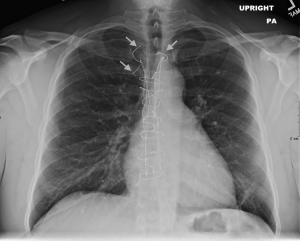
In this dataset, the pneumothorax class is the most obvious, with no distinction between treated and untreated pneumothoraces. Patients with untreated pneumothoraces have a high rate of death, patients with treated pneumothoraces don’t. Pretty important difference.
Looking at a subset of 100 CheXpert films, it looks like about 50% of the pneumothorax cases have chest drains. I was hopeful that the “support devices” class might help differentiate the cases with and without drains, but it doesn’t seem to be particularly helpful; after excluding cases with support devices, there are still about as many chest drains in the pneumothorax images.

On the left, a patient with an untreated (tension) pneumothorax. They are going to die without treatment. On the right, a treated pneumothorax, this patient is not at risk. Note that on the right, the lung isn’t even collapsed, the only sign of a pneumothorax is the chest drain. The vast majority of pneumothorax images in the CXR14 dataset were like the image on the right.
The fracture class has a similar issue. The majority of fractures we see clinically are healed fractures, which we often mention in reports. These are unimportant and need no treatment. New fractures look completely different.

Snapped twig vs white lump, old fractures are far more common, and look nothing like new fractures.
We know the labeller does include old fractures in this class, because they give an example in the paper.

Old rib fractures get labelled as “fractures” in this example.
It was very hard to assess the images for fractures in low-resolution, so I don’t have a lot of confidence, but I did see a fair few old fractures on a quick look through. I also noted a few cases with no obvious fractures, but with broken sternal wires. These are often reported as “fractured wires”, so I wonder if there is a label disambiguation problem in a small subset of the cases.
This isn’t from the actual dataset, since I wasn’t sure if I am allowed to post films online as part of the terms of use, but this is an example of fractured sternal sutures.
Another classic stratification in CXR interpretation is erect and supine (standing and lying down) films. This is easily learnable by models, and patients who can’t stand up for an x-ray are usually much sicker than those who can. These groups have different clinical implications, and knowing how well the models perform in each group would be useful. Films taken in inpatient, outpatient, and emergency settings have a similar problem that can create lead to wildly different performance levels in these important subgroups.
The other (probably less serious) examples of nodes that contain multiple image patterns are “edema”, which can be seen as lines or clouds, and pneumonia, which can have a focal or diffuse appearance. These are less concerning though, because for example the treatment for interstitial and alveolar oedema are the same. These are examples of subclasses that are not as clinically important.
Documentation:

This guy gets dataset documentation.
To me, the documentation of any dataset is the most important part of any data release. Good documentation should:
- describe the label generating procedure in detail, including explicitly addressing any errors that arise from it.
- if there are labels made by humans (such as the test set in CheXpert), describe in detail the features that define each label.
- describe the subjects in the data in details. How many there are, the level of repeat studies, demographic characteristics, and so on. This is important to estimate the portability of the results of any model trained on the data.
- describe a visual exploration of the data, again highlighting any unexpected features of the dataset.
- clearly state how the data is meant to be used (and how it should not be used). In particular, the team producing the dataset should have considered the clinical relevance of their data, especially the labels. This need not be prescriptive, but at the very least, there should be some discussion of the likely clinical limitations of the data.
While this seems like great expectations, I personally feel that there is a significant disparity between the teams that build datasets, and the people who use datasets. The groups that build datasets have a huge advantage when it comes to understanding that data:
- they designed the labelling process, so they already know how it works and where it fails.
- they understand the local environment the data came from, including all the little eccentricities about how the data is produced, stored, etc.
- they have access to medical expertise, and specifically expertise that is local to the data itself.
- they have access to additional information that in not released in the dataset, such as demographics, written reports, and so on.
Users on the other hand have none of these advantages. If a paper says (like the CXR14 paper did) that the labelling process is over 90% accurate, many users will simply take this at face value. They have no way to question it, since they do not have the medical expertise required to check for themselves.
Because of this, I feel it is the job of the teams that release the datasets to thoroughly explain them. Even though it takes time, it is still only a small fraction of the time it takes to actually release the dataset in the first place. And let’s be honest, it is still a tiny price to pay for the massive benefits academics receive from releasing a famous dataset (citations, fame, headlines, and all the grant power and personal acclaim that comes with it).
So, how is the CheXpert documentation?
Unfortunately, like in the CXR14 paper and the MURA paper, the Stanford team has squashed two papers into a single one. They present the dataset, and they present the results of their model on that dataset. In fact, only 2 pages out of 9 are about the dataset, with the rest about the model.

Before I climb higher up on my high horse, I should point out that this isn’t Stanford laziness. They have definitely followed standard practice, especially because their paper was submitted to a technical conference. In this setting, they are required to demonstrate technical novelty, and so they focus on that aspect (even though, IMO, the dataset is way more interesting and “novel”).
The problem is, IMO, standard practice is wrong.
In this paper the two pages that have been written on the data are great. They explore the automated labeller in detail, as I have already described earlier. In particular, using human labelling of 1000 reports is a great move here, as is showing results separately for positive mentions, negations, and uncertainty labels.
Unfortunately, this is where the dataset documentation stops.
The characteristics of the subjects are not described. We don’t know the number of repeat studies per class or overall (the new appendix says there is 3.45 studies per patient), nor the gender or age distribution. We don’t know if the films where obtained in an outpatient setting or intensive care. We don’t know the ethnicities of the patient cohort. All we get are the number of studies per class.
This is especially important for the test set, and while the division of labels was not in the original paper, the Stanford team are including this in the appendix.

It isn’t a tiny test set, but the reliability of the results on the smaller classes (say, under n < 50) is going to be limited. Overall, just based on this distribution, I would expect pretty reliable results on the effusions and support devices (whatever is included in this class), which are not only larger sets but are also less variable in appearance. I would also expect absolutely no ability to determine if the model can recognise rare fractures, since those 5 fractures are almost certainly all going to be rib and maybe vertebral body or clavicle fractures. Even if an arm fracture or scapula fracture snuck in, you don’t get reliable results from testing on a single example.
This sub-type issue is also unexplored, as the team does not present results from a visual exploration of the data. With human visual review, they don’t only get good quality labels for the test set, but they should also know something about the distribution of subclasses (like arm fractures vs rib fractures).
We do know how the original labels compare to the expert labels, sort of.

They present results of radiologists and original labels on ROC curves for 5 out of the 14 classes. They present the original labels as an upper bound (LabelU) and a lower bound (LabelL), which isn’t explained in the paper as far as I can see, but presumably means “if all of the uncertain labels were right” and “if all of the uncertain labels were wrong”. We can see from this that the labels are potentially as good as the human ones, but most likely are a fair bit worse (below the curve). I think this result could be expanded (for example, showing results when uncertain cases are excluded) to better understand this comparison.
My personal preference would be to have two dedicated papers. For the technical conference, the paper as is could be submitted. But a comprehensive paper to document the dataset, even if it is just on arXiv, would be hugely useful for the community**. No-one would begrudge them two papers, or accuse them of paper splitting/salami-slicing***. This way, even though there is extra work to be done, they team unequivocally gets a benefit as well, having a second publication.
Image quality:
The dataset is offered at two quality levels. At this stage, I have only downloaded the small version, which is 11GB. The “original” scale version is 439GB, which is a fair time and data commitment on my Australian internet plan 🙂
While the “original” images are not downscaled, they have been reduced. These are 8-bit png images, meaning they have 256 grey levels. Clinical x-rays are stored at 16-bit, or 65,536 grey levels (although to be fair, we only use between 3,000 and 4,000 grey levels in practice).
This downsampling is actually pretty significant. I’ve noticed on several datasets now that this can obscure pathology quite a bit. It is like reading the image with a single window preset.

These are the same image, presented showing a different range of grey-levels.
In particular on chest x-ray imaging, this can make it hard to see retrocardiac opacities, and subtle pneumothoraces.
I can’t comment on the image quality more than this, because I have only looked at the low-res version. I guess I should say that the low-res version is extremely non-diagnostic and should not be relied upon, but I expect the high res version to be much better.
Overall impression:

I haven’t actually seen this show. Is it good?
On balance, I think this looks like a great step forward. They have solved a number of issues that limited the value of CXR14, including developing a more clinically-oriented labelling schema, offering the images at native resolution, and producing a test set using expert visual analysis.
This is a first impressions post, so I don’t want to make a strong judgement too early, but I think it is pretty safe to say that this dataset is the best quality chest x-ray dataset we currently have. I’ll even go as far as to say that it might be close to the best achievable, if we are stuck with using NLP on reports to make the labels.
But for a more definitive review, and in particular to answer the question “is this dataset fit for training medical AI systems?”, that will take some time.
I can say that based on first impressions, there are still some important weaknesses in CheXpert.
Most importantly, the documentation is lacking, and could easily have filled a full paper, with a thorough description of various aspects of the dataset. Knowing the various characteristics of the patient cohort in both the training and test sets would be very useful, as would getting a deeper explanation of the label definitions. I’d be thrilled if there was some sort of clinically-guided subset analysis done, and if the team would provide some guidance of the limitations of the various labels. The team’s willingness to improve the documentation is very promising though, and I am hopeful that many of these questions will be answered.
Notably, the team is pretty keen on the idea of identifying which labels seem to be most reliable, and which ones may be less clinically relevant. Matt Lungren suggested a “star-rating” of each label, where the truly useful, “ready for production” labels are given 5 stars, and the ambiguous, “potentially risky in clinical models” labels get 1 star. I love this idea, since it solves so many of the concerns around the unintentional/unknowing misuse of public data. While the question of who will produce such a scoring system is still up in the air, watch this space 🙂
On other issues, it remains a weakness that the labels are still extracted via natural language processing from reports. While the labeller appears to be a significant improvement on the previous SOTA, it still appears to suffer from the lack of information contained in radiology reports, with 5-15% error rates in most label categories.
The downsampling of the images, with heavily reduced grey-level range, does limit the assessment of some pathologies, but it is still worth pointing out that this is still the best quality public dataset we have so far, with over 400GB of data. Without downsampling this size would have multiplied many times over.
There are still a significant number of repeat scans, with 70% of the scans coming from 30% of the patients. This definitely reduces the effective size of the dataset (because many studies will be extremely similar, the diversity is not what you would expect from the headline number of studies).
Finally, while the label schema is great, some of the nodes are not “terminal” clinical classes. There are still visual subsets present, which have different clinical implications. This does limit the clinical usefulness of these classes.
MIMIC-CXR
I’m totally piking on this one. I promised a reaction to both datasets, but unfortunately I can’t fulfil that promise. While the MIMIC dataset is publicly available, it is much harder to access than CheXpert.
The process is as follows:
- Follow these instructions, including doing a course on research ethics.
- The research ethics course has 9 parts with 9 quizzes. I already knew almost all of the answers, and without taking any time to read or look them up, this took me around 40 minutes to complete
- Send a request to access the MIMIC database via physionet
- Wait
- Once approved, go to this link for the download (at the bottom).
This process, quite frankly, is a bit much.
I’ve completed the course and I am waiting for approval. 3 weeks and counting. So I don’t actually have the data yet.
I could just look at the paper and give you some impressions, but without the images it will be too incomplete. So far, I guess my impression is “lots of images, probably not as high quality as CheXpert”, but I will have to revisit this at a later date.
Conclusions
We have a bunch more images to play with now! The chest x-rays available from these two datasets and the CXR14 data combined are pushing towards the magical 1 million mark. This is fantastic.
The CheXpert dataset is also a step forward in quality, in my opinion. The labels are better defined, and more clinically relevant. This is the best public CXR dataset we have.
The extreme time cost of labelling images by hand still means we are stuck with NLP labelled data, and there are significant (possibly fatal) limitations to this approach, but this dataset pushes NLP as far as it will go, and might be as good as we get anytime soon.
On the negative side, we need more thorough documentation and discussion of these datasets at release. There are still flaws in the data, which will undoubtedly impact on model performance. Unless these problems are explained, many users will not have the ability nor inclination to discover them let alone solve them, which is something we need to do better as a community.
TL:DR
- CheXpert is bigger and better than ChestXray14.
- It still isn’t as big as it sounds, with 3.45 studies per patient, with this repeat imaging reducing variety.
- They have tested the NLP labeller thoroughly, and show it performs nearly perfectly, producing labels that accurately reflect the reports most of the time.
- The labels still contain errors. NLP will always miss a pretty significant number of findings, because reports don’t actually describe the images. But this might be as good as it gets unless we devote hundreds or thousands of expert-hours reviewing images.
- The dataset documentation could be much more extensive, and honestly deserves its own paper. Say no to combined dataset/AI-model papers!
- The team is willing to provide more information, which is great. The paper has a new appendix either out now or coming soon.
- The test set is probably too small for reliable test results for quite a few of the classes, particularly fractures and pneumothoraces.
- There are a few clinically important subgroups that aren’t mentioned in the paper that could be really problematic for anyone building models with this data, particularly fractures and pneumothoraces 🙂
- The images are at native resolution, but the range of grey levels is massively reduced from ~4k to 256, which can hide pathology.
- Overall, better than before, and the best we currently have, but still some room for improvement.

I have been following your blog and I am so happy that you are presenting the problems of the open datasets.
Personally, I find each source (CXR14, MIMIC and CheXpert) labels to be of unsatisfactory quality. I even looked at CheXpert labeler text mining principles, which for me looks prone to errors. On the other hand, I completely understand how hard it is to make labels to be satisfactory – have spent several months on a local dataset myself.
However, I want to point out, that downscaling 12bit greyscale information to 8bit is not necessarily losing information. From a few experiments I had working with raw dicom data, the neural network’s loss in AUC or other metrics is insignificant.
LikeLike
Hi Darius,
I am inherently skeptical of text mining, and it sounds like you are too. Personally though, I think edge cases (labeller failure) are less likely to be a problem than the missing information inherent to reports.
The only real way to improve on this is to use human expertise to view images, which I’m sure you will agree can take a ridiculous amount of effort. There are some clever ways to reduce the burden, for example I personally labelled 40k hip x-rays up to >99% objective accuracy (based on outcomes like the surgical presence of a fracture), but only had to label a few thousand images by hand. It very much depends on the dataset, though, and it will always be much more time consuming than an NLP approach.
Re: downscaling, I agree that my comment is about how readable they are to me, which isn’t the same thing as how readable an AI finds them to be. But I will say that the problems I had were subtask dependent – it was retrocardiac opacities for instance. If you only test on a superclass (like “opacity”) this failure will be obscured.
LikeLike
About DICOM scaling …
I worked with chest X-rays and teeth X-rays (I know they are different, I am not a doctor, for me they were just big matrices), and what I found:
– Image pre-processing hardly matters (CNNs accept float values, i.e. 0-1 – how you obtain these values does not seem to matter much – either you take 8-bit image, 16-bit image or do some weird pre-processing / rescaling);
– As a human being, I can hardly see anything on raw dicoms, the reason being – the dynamic range is always “broken”. I understand that this is probably due to interference / tissue density / tissue size, but when you apply histogram equalization or any similar adaptive image enhancement technique – to me as a layman images instantly become more readable. But CNNs actually do not really care …
– Same applies to satellite imagery by the way;
LikeLike
It is true to a point that CNNs can cope with a variety of preprocessing etc. but in this case, the problem is one of absolute information loss. If the heart is pure white (ie 1.0) and the pathology is behind the heart, then no fancy CNN can help. The information is gone.
On a full DICOM, the heart is more dense than lung, but nowhere near the top of the range, so heart + mass is more brighter than heart alone.
Does that make sense?
LikeLike
Yeah, it makes sense
But probably from the standpoint of obtaining the best classifier possible, it just makes sense to exclude such images as “hard cases for manual processing”
LikeLike
Dear Luke, I like what you write in general. I am finishing a book on AI in medicine to be published by Elsevier. Would you like to write a short (500-1000 word) commentary on a topic you are passionate about? Best, ACC
| Anthony C. Chang, MD, MBA, MPH, MS Chief Intelligence and Innovation Officer Medical Director, The Sharon Disney Lund Medical Intelligence and Innovation Institute (MI3) | | Children’s Hospital of Orange County T: 714-509-8220 | C: 949-547-8902 |
Coming December 2019! The World’s Largest and Most Comprehensive AI in Medicine and Healthcare Meeting: AIMed 19 December 11-14, 2019 | Ritz-Carlton | Dana Point, California |YouTube: AIMED 2017 |YouTube: AIMED Europe 2018
LikeLike
I’ve sent you an email, cheers.
LikeLike
I’d be interested to hear if anybody has actually had any success with the CheXpert labeller (https://github.com/stanfordmlgroup/chexpert-labeler). I’ve tried on three different platforms but failed to get it running. There seems to be a particular problem getting bllipparser to play nicely…
I’m keen to see what labels get generated when I throw some of our clinical reports at it.
LikeLike
Hello Dr.Luke,
Excellent thoughts about the CXR datasets.
I’m a graduate student at harvard trying to use the CXR dataset. However, I ‘m having trouble with extracting the Chexpert dataset. Train dataset is only partially downloaded. Did you even face the same problem anytime? Any help would be much appreciated.Thank you
LikeLike
I’ve only downloaded the low resolution version at this stage, which version are you having trouble with?
LikeLike
Luke, thanks for this incredible series of posts.
I’m looking for but haven’t found the exact specifications of CheXpert. What are the image resolution and bit depth for the ‘small’ version of CheXpert?
LikeLike
Dear All,
I am a student majoring in bioinformatics. I am trying to use this dataset to build a deep learning model. May I ask what the “-1” means in the “train.csv”? It seems like “uncertain” per my understanding of the paper. But I am not sure. If so, there is no chance for us to know it is likely uncertainty or unlikely uncertainty, right?
Thank advance for your kindly answering
Ryan
LikeLike
That is my understanding too. In the paper they use the uncertainty labels in a variety of ways to understand how they are best incorporated, but my reading is that the results are fairly inconclusive.
LikeLike
Very well said Luke, In many cases labels does not conclude to yes/no answer. By the way I used cloud VM to download 439GB dataset on the US region rather than call for a war with my Optus data plan 🙂
LikeLike
Hm, I wonder what the author thinks about this dataset
https://static.medium.com/embed.jsView story at Medium.com
LikeLike
It isn’t publically available, so I can’t comment. Mammography datasets are usually the highest quality, since clinically we put a huge amount of effort into ensuring the performance of readers in screening programs.
LikeLike
Hi,
Thank you very much for this very enriching post.
I believe you touched on precise issues in this dataset. Hopefully, future datasets would take these concerns into account. Also, I totally agree the dataset papers can stand by themselves.
I wonder how can one get access to the cheXpert/cheXbert underlining dataset reports? these reports are not part of the official dataset.
LikeLike